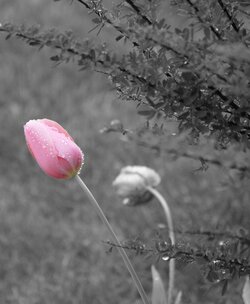
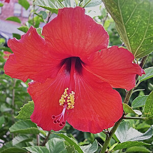
The edge of the original flower head is showing very slightly on the bottom left and the B+W could use a bit more contrast for my tastes but a pretty good first attempt, a helluva lot better than mine.
I use PS Elements. I was able to split the tulip and the background into two layers. Then, the background I changed to black and white and then saved the image. I'm going to work on the contrast as others have mentioned. I have yet to have a good eye for contrast and brightness.
A tip I picked up is don't be afraid to really crank the contrast when converting to mono, you really want to make the most of the detail. You can always compensate slightly with the brightness or fill light if needs be.
Actually I found the contrast to be fine on your B&W. But one tip to be aware of: whenever you do a color to B&W conversion (whatever method you choose), it's a good idea to re-check the Levels on the B&W. It sometimes needs to be readjusted.
Some people think this process - I call it "Colorizing" or "Selective Color" - has become trite and overused. But when well done it can be a very nice creative device.
I have an entire collection of what I've named "Escapes" on my Cafepress site. (Address in sig below) These are all flowers. And at least a part of each colored segment appears to be actually escaping the frame. You might find them interesting.

")


![[No title]](/data/xfmg/thumbnail/36/36600-689bc868e20f53581a083c9054ee0e47.jpg?1619737641)