Trying to get on next level - series 1

dsquared

TPF Noob!
Joined
Jul 20, 2011
Messages
59
Reaction score
2
Location
B&H
Can others edit my Photos
Photos NOT OK to edit
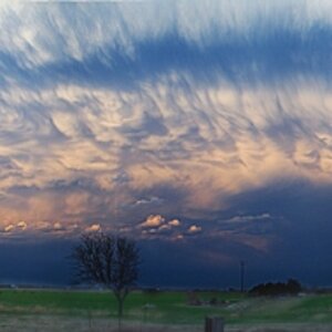
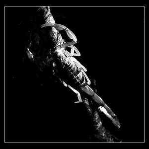
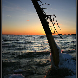
I need comments and critics for these photos:


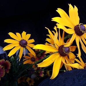
(I've got this photo without that black "hole" in the left down corner... so tell me what's better, with it or to remove that?)
klavir1.jpg


(Pula,Croatia)-Arena
pula1.jpg


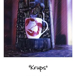
(Testing... Retro Splash!)
retro-splash.jpg


thanks for comments, in advance
 
C&C per req:

1. I would prefer the image without the black area in the lower LH corner. I think that this image has been attempted so many times that it really has little appeal left. If you are going to do it, I would suggest composing it such that the nearest keys are in sharp focus and the focus recedes into the background.

2. I think there was something here; not sure if this is it or not. I think a slight brightening of the interior would help, and I think an image cropped so that you only had a single arch around the moon might work as well.

3. Interesting... the sepia cast does nothing for me.

I'm not sure what 'level' you were striving for, so I have no idea if you made it. They're a nice enough set of images. Some explanation of your thoughts and intent would help.

Just my $00.02 worth - your mileage may vary.

~John
 
1) I'd remove the bottom left. To me this shot doesn't work unless you're shooting a really well made keyboard. To me, all I see here is a cheap plastic keyboard. But I have a music background, and I know what a premium keyboard on a really nice piano or organ looks like. So, that might or might not bother others as much.

2) I like the image a lot. THough I agree that the inside wall either needs to be pure silhouette or lit better. It's in a kind of murky area that I think is distracting. I'm really partial to small subtle details. I personally wouldn't like the image as much if the moon was more obvious, so I think you nailed that aspect, to me at least. I think it's cooler with though 'oh wait, there's the moon' idea. Though it would obviously depend on the purpose of the photo. The light in the very bottom middle is really distracting to me. I spend too much time wondering what that light is, where it's coming from.

3) Love the subject, hate the background. I think you really captured a neat 3D effect here, I can almost see the droplets coming at me. But that background drives me crazy. The lines in the bottom left, the shadow off to the right.
 
#1 - OOF, #2 - OOF, #3 - Way too much sharpening. You can see the unnatural outline it caused on the stem of the glass. But I still think that is the best of the 3.

Hit reset and try again.
 
Thanks for critics. You don't even know how much I appreciate it...
@tirediron I'm still looking for style that I love... All the time looking for good frames around me, light and other stuff that goes with photography... So, I can say I'm still learning... I need you all to help me to reveal my mistakes, that I don't see... Thanks a lot for comment, hope you will take a look at my other works I post...
@fjrabon Thanks for critics, it helped me a lot. Now I see that 1st photo is boring and usual-photo... And for the bg of 3rd photo, yeah, I know I screwed that, the "plain" behind that is guilty...
@DiskoJoe Now I see that...

Thank you all!!!
 

Most reactions

New Topics

Back
Top