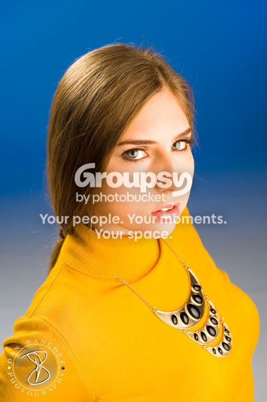
as said, #1 is not a very flattering angle. Yeah, I was afraid of that too.
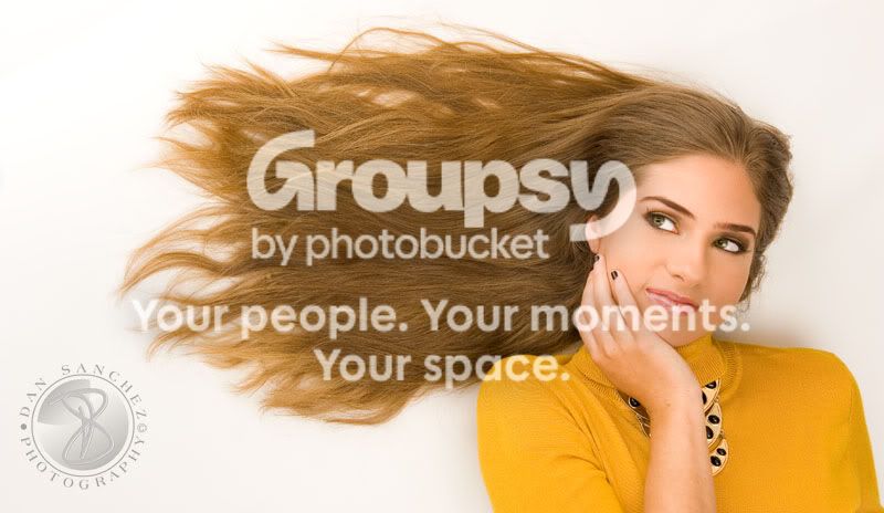
#2 looks too much like a typical myspace photo. I'd try a different angle again.
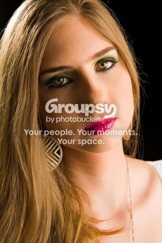
#3 is interesting. I can see where you erased the background to make it white though. Didn't even touch the background in post processing. Also, the white that is peeking through her hair is warm due to the reflection from the hair... not sure what you can do to get rid of that.
#4 I think I'd use a different depth of field to have either more or less in focus... probably more. That's just personal preference though, I think it's a great shot. There is some clipping on her left shoulder and chest area, but it isn't too bad. Still working on my lighting, I seem to always have it just a touch too hot.
On the whole, as your studio shots go, I think you'd benefit from slightly more even lighting. you're getting good detail on the "dark" side, but you're losing detail on the lit side. maybe you could speed up the shutter 1 or 2 clicks to combat that if you want to have a shaddowy effect... I dunno, just personal preference.









![[No title]](/data/xfmg/thumbnail/36/36675-f6965e1e6c1fa2be4ff0460e9657fe99.jpg?1734169174)
![[No title]](/data/xfmg/thumbnail/39/39442-c7791194bfea1b4d6bd382b004fb8488.jpg?1734173531)
![[No title]](/data/xfmg/thumbnail/36/36676-cb11e40ab23f22c2a0af6fbf4ab02371.jpg?1734169174)
![[No title]](/data/xfmg/thumbnail/34/34696-6e05b4fd94e150fc3d00ade3eb069dd6.jpg?1734165703)