Ernicus
TPF Noob!
- Joined
- May 18, 2012
- Messages
- 2,689
- Reaction score
- 337
- Location
- Old Town, ME
- Can others edit my Photos
- Photos OK to edit
- Banned
- #1
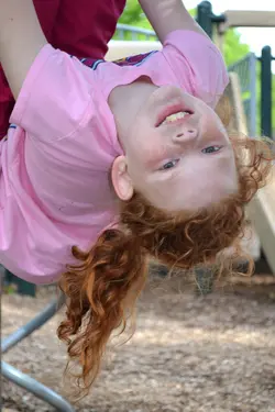
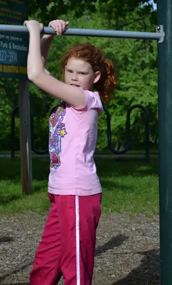
I have been reading and I want to learn to start shooting people. I was practicing on the kid in the park today. Didn't practice on posing, as I was lucky to get her to hold still for longer than 2 seconds. I have no accessories, so I am trying to learn to use natural light and finding scenarios that work with it.
What I would like your opinions on is a situation I am noticing with my camera, and post editing (as I kinda suck with people, colors, skin tones, etc).
Yeah the sky is blown out in upper right, not concerned with that. Mommy loves this photo, but to me it looks off...honestly I was going to call it a loss and toss it, but she is making me keep it. So I come to you folks to see if it can be made better.
I was testing various modes on the camera, seeing what settings AP used, vs my Manual, using kids and action on the dial just for chits and giggles. I literally have zero experience shooting people, only read knowledge over the past week or two. So talk to me like I'm dumb on this one.
I notice that the exposure meter (hope I'm calling it right) on my camera is showing dead on in the middle...histogram showed a nice swell in middle. yet when I load up pics in ps, histrogram is more left than dead center. All my pics are seemingly like this. Histogram in camera and histogram in ps are off, always to the left. Why would there be a difference? Should I "overexpose" a bit , for lack of better words, since my stuff is seemingly coming out on the under side?
Lastly, the post editing part. I cannot put into words what I feel when I see this photo, however I feel something is wrong. I tried to adjust levels a bit, but after that, I really dunno what to do to it to try to make it better, mostly because I can't put a finger on what's wrong...but I know something is wrong.
Thanks for taking the time to read all of my cluttering jumbo and thanks in advance for your advice and help.
The first is my edit trying to lighten it up, the second is the original. Feel free to edit it yourself or just tell me what you would do and I'll give it a whirl. I use photoshop. Thanks.


