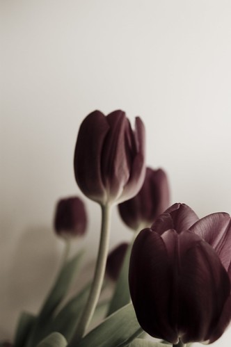
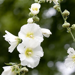
The foremost blossom (lower righthand corner) takes the focus, but large parts of that blossom are quite dark (and even went darker with the partial desaturation, maybe?), which I think does not do the concept much good. That one should show its being sharp and in focus all over, so I think. I'm also struggling with the amount of empty space in the upper left, I wonder what it is there for ... and the amount of room there but limited focus on the ONE blossom squeezed into the opposite corner makes me feel something about composition is not yet at its best... but that is subjective, like anything.
(Mind you, I am not all sure I like the partial desaturation, either).








![[No title]](/data/xfmg/thumbnail/37/37660-eb4529b6ea38a042c4e9b64866178d7b.jpg?1734170816)