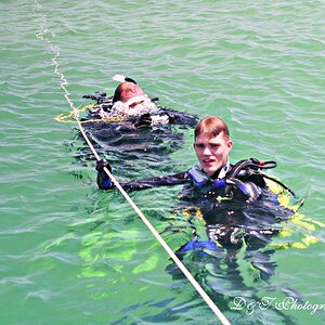
IMO, the first one is hurt by the burnt out area on his forehead. What a shame. This may be recoverable if you have a raw image. If so, I would also look at cropping the left side and bottom to get him off the dead center and remove a little of the empty space behind him. The background is very interesting and certainly adds to the mystery.
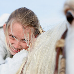
The second one is great. Good composition and terrific PP. You might try a tiny bit of both Unsharp Mask and High pass filter to emphasize the grain and edges. It looks like you have toned this and then vignetted. The vignette on the upper left seems a little dense and a different shade. If you plan on toning, do all the vignetting first or pick a color that matches and vignette with a soft brush.
Both of these are really, really interesting and good.
IMO, the first one is hurt by the burnt out area on his forehead. What a shame. This may be recoverable if you have a raw image. If so, I would also look at cropping the left side and bottom to get him off the dead center and remove a little of the empty space behind him. The background is very interesting and certainly adds to the mystery.
To much vignette in both.
First one is to bright on his head to dark everywhere else.
Second one the sky is blown the building is to dark, since the sky is blown anyway let it go and increase the exposure on the building.

")


![[No title]](/data/xfmg/thumbnail/34/34056-de7cd932b4cd702c2f77e0f5c9ec1aa2.jpg?1619736256)