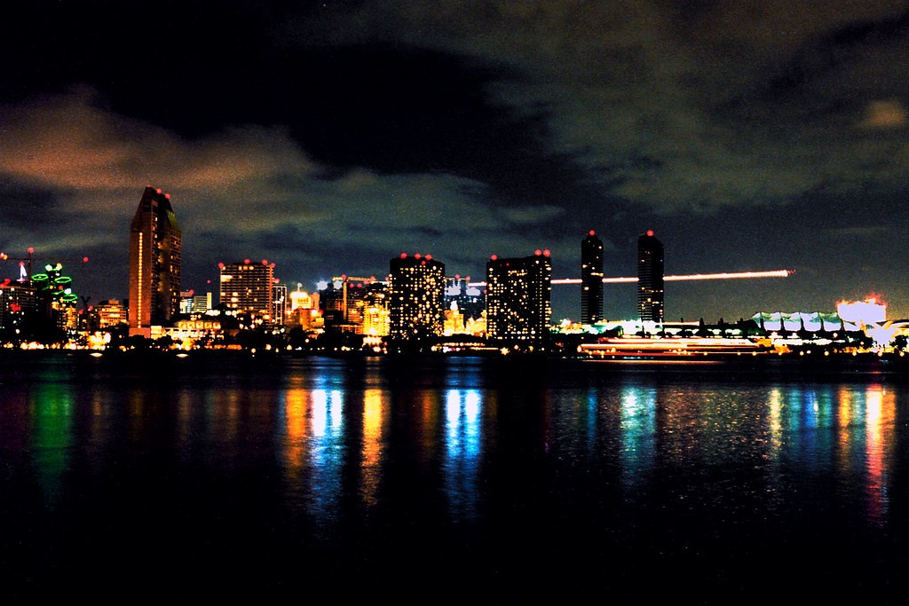
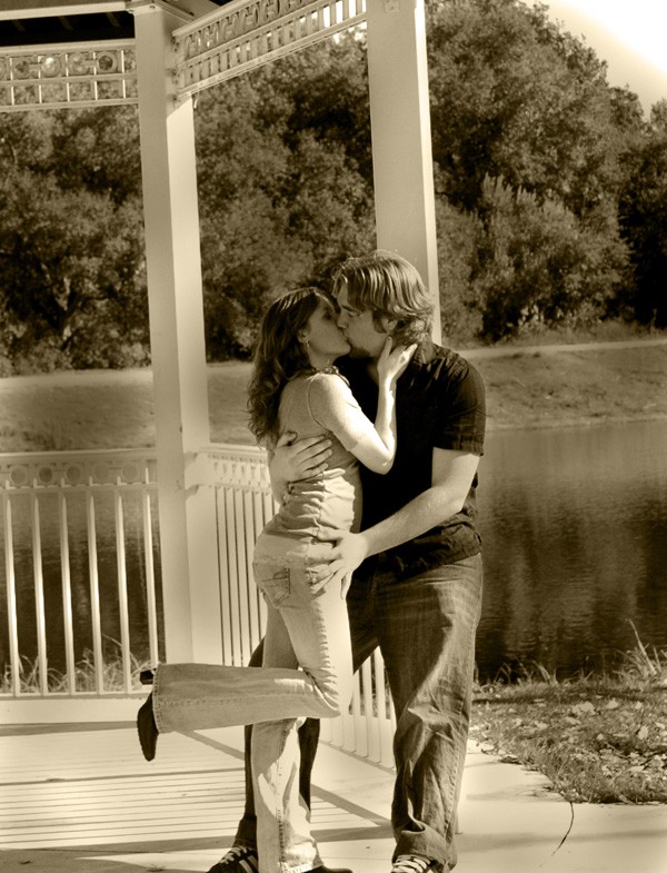
I like the first one, the streak of light (plane?) gives it a good sense of direction, without it I think it would be too heavy on the left. Good shot. The second one is a little top heavy- my eye is drawn to the dead space and not the couple, and the feet being cut off doesn't help. Good moment though
Did you take that first one handheld, using all your camera has on offer so it'd work out? Like the highest possible ISO, the widest open lens? All to cut down exposure time? (Though the light streak of the plane suggests otherwise :scratch: !?!?)
The second ... yes, I do miss their feet. Quite a bit. Would have been easiest to include them.
The first picture is totally ruined by noise. I'd rate it un-usable for anything.
The second picture looks like you've tried to give it that "old and vintage" feel with the post processing, but it fails as the people in the shot have a distinctive modern look to them. I would have gone with a normal color version instead. The what-ever-they-are-standing-inn is also too crooked. I get the feeling it's falling over to the left when looking at the picture, which is quite distracting.
And I have to agree with the others that I would have been much better if their feet had also been in the shot.
I have to agree the first shot does have lots of noticable noise in the sky. I like the idea of the second shot but if it were cropped in a bit closer while keeping the feet in the photo and straighting the structure. Good ideas you had for both pics.
Interesting you should say that, that photo won Best of Show in Color Photography at the 2002 San Diego County Fair.
I think the noise is mostly a result of my scanning 1200 ISO analog into digital, but alas there was no fixing it in PS. The actual print doesn't look quite as grainy, although it lacks the subtle color on the bottom of the clouds.
As for the second, I didn't even notice the feet when I took it . . . :mrgreen: I was mostly concernedwith getting the timing right. Thanks for pointing that out, I'll have to be more careful in the future.
I've always been a fan of sepia toned images, and don't understand why the people look "too modern" does anybody else think sepia cannot be applied to images taken today? Or am I misreading your message?
Best of show at a county fair doesn't make it a good photo. It just means the standard of the photographs there was really low for such a shot to win. That's just beeing honest, because the image quality is about the same as what a bad mobile phone could shoot. The horrible noise all over the picture, and the softness that has blurred out any detail just makes it a really bad shot.
You can apply sepia to whatever you like, that's your choice. But the result is that it looks like you're trying to create the effect that the photo is very old - which makes the clearly modern dressed people look out of place. It might not be your intention - I'm just saying that is what the image looks like to me. Other people might get something else from looking at it.
first one is great. noise, schmoise. the plane looks like some sort of superhero blazing over the skyline. colours are nice too - what type of film did you use?
")


![[No title]](/data/xfmg/thumbnail/37/37603-739c5d9b541a083a12f2f30e45ca2b7b.jpg?1734170731)


![[No title]](/data/xfmg/thumbnail/37/37604-7ad625e983f92f880eb65a264eeef5e4.jpg?1734170732)