Two light setup, first attempt.

Austin Greene

Been spending a lot of time on here!
Joined
Jan 6, 2012
Messages
1,472
Reaction score
855
Location
Mountain View, California
Website
www.austingreenephotography.com
Can others edit my Photos
Photos NOT OK to edit
To clarify: This is not my first portrait attempt. This is my first attempt at doing a portrait with more than one light.

I had a local photographer friend who volunteered to let me borrow her for some shots. At first I was shooting her with camera in hand, but found that she loosened up quite a bit after I asked her to just set the camera down. I wanted to get her one with her camera, and she wanted one with the vines. I wanted the two to have very a different feel. Somewhat harsh on the camera side (she's a pretty independent lady), while the headshot was intended to be a much softer, more personable image.

My critique: I wish the hair band weren't there, by the time we thought to remove it, the light had dramatically changed. Also, imo the lower background in the 3/4 is a tad distracting. Getting picky now: catchlights could have been better in the headshot, and I'm unsure about the shadow under her left eye (our right) it almost comes across as if it's swollen.

I'm curious to hear your thoughts, this is the first time I've shot using two lights and balancing them with the sunlight. By all means, be honest.


1.

Tamara by TogaLive, on Flickr

2.

Tamara by TogaLive, on Flickr
 
Last edited:
Man, 111 views and zip in the replies department. I'm not offended, but damn if I'm not curious. Considering that normally happens for solid images, or ones which aren't worth the time critiquing, I wonder which category these fall into...
 
I would say these are decent images; the lighting isn't bad, but I think your camera angle in #1 would have worked better if you'd raised it up more toward the model's eye-level.
 
Give it time, a lot of and welcome.
 
Considering that I don't know lighting, I will say that I don't quite understand all the light in #1. You say two lights and the sun, so that makes three sources, and I'm not sure I can distinguish three sources.

So leaving the light aside; You included the background, which probably should not have been included. The model's near side cheek is in heavy shadow, so not flattering.

In #2 it is mostly the pose with the leaves. Very crowded toward the left margin, a disconnected hand, and the shadows on her left side (our right) are little too dark, IMO.
 
Unsure why it took me so long to respond on this thread, oh well, here goes.

I would say these are decent images; the lighting isn't bad, but I think your camera angle in #1 would have worked better if you'd raised it up more toward the model's eye-level.
Any suggestions on how to improve the lighting? I think I'll begin working towards feathering light onto subjects with the softbox. Prior to this shoot, I was used to just bathing someone in umbrella light, and I see now that the softbox really is a totally different beast. Also, I see what you mean as far as being on the same level as the model goes. I honestly didn't even realize until you mentioned it that I was below her. I don't remember crouching, but somehow I got there! Thanks for the critique :)

Considering that I don't know lighting, I will say that I don't quite understand all the light in #1. You say two lights and the sun, so that makes three sources, and I'm not sure I can distinguish three sources.
Honestly, I can't remember now what the setup was, midterms have my brain more than a little fried. I know I had the softbox up and camera left, and the umbrella was just behind her and camera right. I believe the sunlight was just peaking through to our right, but you really can't pick up on it between the two lights, it just blended in. That said, that annoying bit of light in the background is sunlight as well.

So leaving the light aside; You included the background, which probably should not have been included. The model's near side cheek is in heavy shadow, so not flattering.
The background was included more as an accident than otherwise. This was towards the end of the morning, and my flash sync speed just couldn't get me to where I needed to be to really bring down the background. That said, its a totally valid point that the background detracts from it, I just didn't see it then, not to say backgrounds always shouldn't be included.

As for her face being mostly in shadow, that was a decision on my part. I chose to light her via Short Side lighting, instead of Broad Side to help narrow her face. For contrast, the other image was purposefully shot Broad Side as I was experimenting with how I wanted to light her dimensions. Perhaps I could have still achieved the effects of short side by bringing in just a tad more light on her left side in the #1?

In #2 it is mostly the pose with the leaves. Very crowded toward the left margin, a disconnected hand, and the shadows on her left side (our right) are little too dark, IMO.
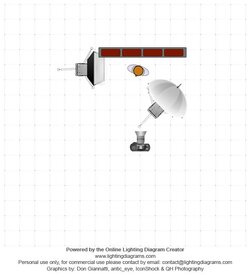
I totally agree on this one. In reality, it was an image that I thought I could salvage in post. Even the lighting setup was weird, I had the softbox 90 degrees to her right (camera left) and then I had the umbrella straight ahead of her, trying to feather some light onto the shadowed portion of her face and the vines. In reality, it probably would have been better to switch those roles. Just going to have to start remembering that, when I have the choice, softbox is to be used for feathering, not the umbrella.

Last, the composition needs work, I agree. I can compose an insect, which I have no control over, but damn it composing shots with people in them just gets to me.

Thanks for all the critique, I'd be happy to hear more :)

Update: This was roughly the setup used on the second shot. Looking back, I don't know what I was thinking. Provided, she had her head turned to her left, but I don't know how to represent that in the diagram.
$lighting-diagram-1383174426.jpg
 
Last edited:
I want to like #1, but something makes me not "connect" with her. I think her body language and expression together are giving off a slightly uncomfortable vibe...as if she's not confident in being shown as "a photographer". Compositionally, her head is too close to the top of the frame, as is her left elbow, and the camera is a bit low as well. The camera height is not as bothersome as her being so high in the frame and off to the side of the frame, and then also there's a lot of below the belt shown, against that bright light in the background. Overall, her relationship to the camera's frame, and to the background, is not well-balanced. Add her slightly trepidation-tinged look, and shot #1 has a bad feel to me. I "want to like" it...she's an attractive, young, fit female...but the photo is not making me feel positive.

SHot #2...HER relationship to the frame is much better. The camera height is better. I wish her hair had not been tucked in behind the ear...that makes the light-toned ear stand out quite a bit, and the white lace blouse is also an eye-puller...white shirts oughtta' be illegal for portraits!

I looked at #3 as a B&W conversion, and also an a vintage-looking, desaturated shot. The wrist band hurts the classic feel, but does tie it to this era, this decade, of this century. It looks good both ways, as B&W or as a desat/vintage look.
 

Most reactions

Back
Top