What's new

Two portraits, opinions?

Cyotheking

TPF Noob!
Joined
May 16, 2013
Messages
50
Reaction score
9
Location
Minneapolis
Can others edit my Photos
Photos OK to edit
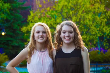
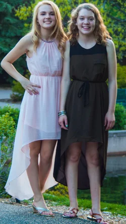
Really happy with these photos and just wanted to see what other people thought :D


$DSC_0268.webp$DSC_0269.webp
 
Something is very overprocessed as you have colors blocking up in the background.
 
Welcome to The Photo Forum.

The background colors are vibrant and your subjects have beautiful smiles.

Your full-length shot (the vertical orientation image on the right) is just a little tight on the crop. You've nipped off the toe of the subject on the right and left very little room for framing. The subject on our left has a pleasant pose with one leg in front of the other and a slight angle to her shoulders (I would have preferred just a bit more). The subject on our right is "square" to the camera -- which is not a flattering pose. Turn her body slightly inward and have her put her weight on one leg and let the other leg relax.

I love the smiles on the left (landscape orientation) photo, although you've done a bit of a "bullseye" with centering. Avoid centering the heads when composing your frame and move the camera down a bit. I this "half shot" (half the body) go for the the waist up (lower your camera) so that their heads are in the upper-third of the frame rather than on the veritcal center.

Exposure-wise, while your background is vibrant, your subject lighting is a little dull. A boost to lighting would help here.

Thanks for posting! Keep at it!

 
Something is very overprocessed as you have colors blocking up in the background.

Woah, I didn't even notice that...thanks for pointing that out.

Welcome to The Photo Forum.

The background colors are vibrant and your subjects have beautiful smiles.

Your full-length shot (the vertical orientation image on the right) is just a little tight on the crop. You've nipped off the toe of the subject on the right and left very little room for framing. The subject on our left has a pleasant pose with one leg in front of the other and a slight angle to her shoulders (I would have preferred just a bit more). The subject on our right is "square" to the camera -- which is not a flattering pose. Turn her body slightly inward and have her put her weight on one leg and let the other leg relax.

I love the smiles on the left (landscape orientation) photo, although you've done a bit of a "bullseye" with centering. Avoid centering the heads when composing your frame and move the camera down a bit. I this "half shot" (half the body) go for the the waist up (lower your camera) so that their heads are in the upper-third of the frame rather than on the veritcal center.

Exposure-wise, while your background is vibrant, your subject lighting is a little dull. A boost to lighting would help here.

Thanks for posting! Keep at it!

Thank you for the advice. Quite a few of the issues could have been fixed if I had a little longer to shoot. They were in a rush to get some where.
As for the bullseye, do you mean do more of a rule of thirds type thing? Sorry for my noobiness, still learning a lot of terms :P
Thanks again!
 
As for the bullseye, do you mean do more of a rule of thirds type thing? Sorry for my noobiness, still learning a lot of terms :P
Thanks again!

Yes - rule of thirds. De-centering works for a lot of different reasons. De-centering vertically helps show a bit more of their bodies -- making the image more about your subjects and less about their background (even though -- make no mistake -- backgrounds ARE important. You did well to keep a healthy distance between subject and background to allow for a bit of a background blur.) De-centering horizontally can force the eye to sweep across the image.
 
As for the bullseye, do you mean do more of a rule of thirds type thing? Sorry for my noobiness, still learning a lot of terms :P
Thanks again!

Yes - rule of thirds. De-centering works for a lot of different reasons. De-centering vertically helps show a bit more of their bodies -- making the image more about your subjects and less about their background (even though -- make no mistake -- backgrounds ARE important. You did well to keep a healthy distance between subject and background to allow for a bit of a background blur.) De-centering horizontally can force the eye to sweep across the image.

Gotcha! I'll make sure to keep this all in mind for next time.
 

Create an account or login to comment

You must be a member in order to leave a comment

Create account

Create an account on our community. It's easy!

Log in

Already have an account? Log in here.

Back
Top Bottom