Under the bridge

sly677

TPF Noob!
Joined
Jan 26, 2009
Messages
75
Reaction score
0
Location
Ottawa Ontario
Can others edit my Photos
Photos OK to edit
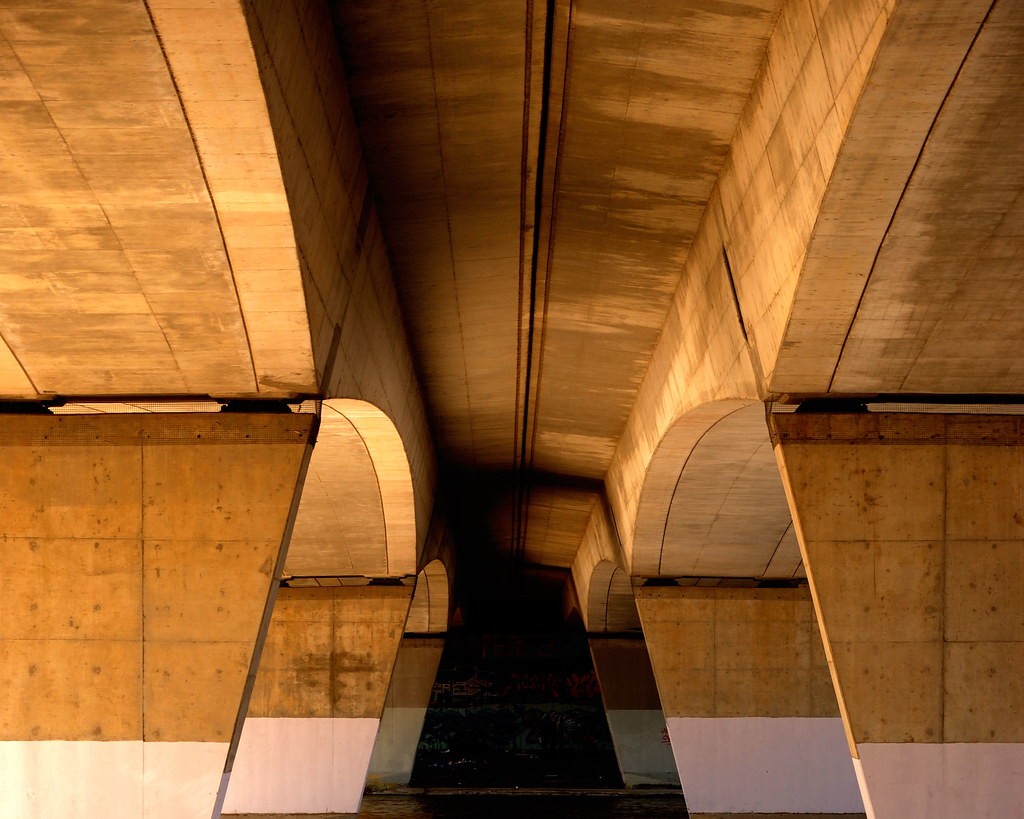
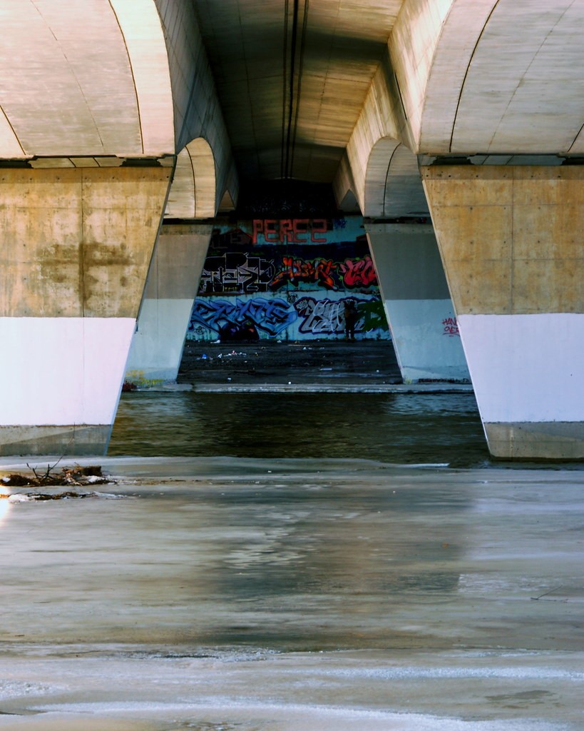
Here are a couple I took just the other day under a bridge close to where I live. I had trouble with sunlight blowing out the pillars on one side, these 2 are the ones I think came out better after some cropping. As you can see there's someone painting some grafiti at the other end. Thanks for looking.


1.
3372516381_02b0d98050_b.jpg


2.
3373308576_d507f9ba0f_b.jpg
 

Rich-D

TPF Noob!
Joined
Apr 13, 2008
Messages
76
Reaction score
0
Can others edit my Photos
Photos NOT OK to edit
I love the colors in the first one, but I like the graffiti in the second one. Good symmetry going on.
 

LisaMarie

TPF Noob!
Joined
Mar 31, 2009
Messages
86
Reaction score
0
Can others edit my Photos
Photos OK to edit
I think they are both awsome, i especially like the colors in the first one, i like the warmer look to this picture. One thing i would mention though(but just because i am big on symetry) is that the first picture is slightly crooked, you can especially notice it when you look at the top of the picture and see the middle line of the bridges off to the right a tad, however, not ever picture requires symetry to be a good shot, and i still appreciate that picture anyways. Good job!
 

richinco

TPF Noob!
Joined
Apr 23, 2009
Messages
3
Reaction score
0
Location
Loveland, Colorado
Can others edit my Photos
Photos NOT OK to edit
Love the warm tones of the first one, And i think i would crop the second a bit more to really make the graffiti "POP" very nice.
 
OP
OP
S

sly677

TPF Noob!
Joined
Jan 26, 2009
Messages
75
Reaction score
0
Location
Ottawa Ontario
Can others edit my Photos
Photos OK to edit
One thing i would mention though(but just because i am big on symetry) is that the first picture is slightly crooked, you can especially notice it when you look at the top of the picture and see the middle line of the bridges off to the right a tad, however, not ever picture requires symetry to be a good shot, and i still appreciate that picture anyways. Good job!

I think I see what you mean, it's really just a little bit. I hadn't noticed it before.

The warmer colors are pretty nice I find. I will have to try and see how I can make the grafiti stand out more with CS3.

Thanks for the comments everyone.
 

Most reactions

Top