What's new

Untitled

manaheim

Jedi Bunnywabbit
Staff member
Supporting Member 📸
Joined
Sep 2, 2005
Messages
14,457
Reaction score
3,329
Can others edit my Photos
Photos OK to edit
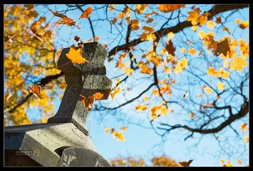
No idea what I'd call this... c/c welcome if desired.

Concord%20Cemetery%20-%20148.jpg
 
Manny, i think this is not a good composition :blushing:

Sorry
 
  • Thread Starter 🔹
  • Moderator 🛠️
  • #3
What don't you like about it?
 
I can't say that analytically.. but something blocks me from being impressed by this one. Purely a personal feeling; please don't feel bad, i request :D
 
Glad I am not alone shooting these shots. I once got stopped by a groundskeeper as to why I was taking pictures in their cemetery.

Angle is nice, the shadow on the tombstone is my favorite part. What if you darken it is a bit without loosing the brightness of the foliage?
 
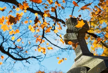
I love it. The issue I find in terms of the composition (and this may or may not be what Frequency couldn't articulate) is that the strong lines at the bottom right distract from the subject, leading the eyes away from it. If you flip the image, just as an exercise, the flow changes dramatically, with the lines now leading the eye towards the subject:

$Concord Cemetery - 148_flipped.webp

Still, that dark corner (now at the bottom left) disrupts things a bit. Also, I think that the original placement of the cross (to the right of the frame) worked best, not to mention that the inverted letters suck. So here's what I've come up with:

$Concord Cemetery - 148 copy_edited.webp

I recropped the image to lose that dark corner as much as I could and also to minimize the impact of those strong lines. I also reduced sharpening of the whole corner. While I was at it, I lightened the cross and darkened the rest of the frame, inspired on myvinyl's suggestion. It's a quick and dirty job, and you don't have to like it.

Needless to say, let me know if you prefer that I take down the edits.

Like I said above, I love the image. I'm never able to come up with any cool cemetery photos, and images like this are the stuff that I aim for.
 
I dont mind the composition bit I do think it would be much better if it was straitened.
 
I like it; no particular reason.
 
yes, probably the "Ready To Fall" feeling was the reason for my discomfort...


I felt a bit more happy with this
 
  • Thread Starter 🔹
  • Moderator 🛠️
  • #10
ooof... straightening it is soooooo wrong. :lol: (sorry, it's just so not the way I envisioned it) I know some people get weirded out by photos with a bit of tilt to them, but sometimes with pictures I focus more on the lines and how they lead into each other than I do on the literal capture of the scene. This is one of those cases.

Federico, thanks so much for the analysis. I think I see what you're saying. I need to copy all your edits to my desktop so I can flip through them and look at them more closely in comparison to mine. (and no worries on putting up edits- it's all good!)

Thanks everyone for your comments. Very interesting to hear the different perspectives.

 
I like the feeling of "toppling over" in this, I see the cross first then notice the leaves falling, neat idea.
 
ooof... straightening it is soooooo wrong. :lol: (sorry, it's just so not the way I envisioned it) I know some people get weirded out by photos with a bit of tilt to them, but sometimes with pictures I focus more on the lines and how they lead into each other than I do on the literal capture of the scene. This is one of those cases.

Federico, thanks so much for the analysis. I think I see what you're saying. I need to copy all your edits to my desktop so I can flip through them and look at them more closely in comparison to mine. (and no worries on putting up edits- it's all good!)

Thanks everyone for your comments. Very interesting to hear the different perspectives.

Sorry... straightening it completely ruins it. I like the drama of the tilted cross and falling leaves. Very cool!
 
  • Thread Starter 🔹
  • Moderator 🛠️
  • #13
Thanks Rick.
 
I'm probably late to the party, and the food's all gone, but what the heck. I'm curious what you would have had if you had a much more shallow depth of field, with the focus on the closer arm of the cross. The falling leaves would still be clear, but the background branch would be more of a suggestion of a branch. Can't help but think that a little motion blur on the leaves could have given it more zing. or am I completely missing the point?
 
I think the composition is fine, but the exposure was a bit bright. Invisible's edit was good. I like to see distinct shadows on the monument. I also don't mind underexposure when it comes to subjects like this. You'll often have overexposed parts (such as the base where the cross rests on).

Is there a reason why some leaves have white outlines, or is it simply the back lighting from the sun?
 

Create an account or login to comment

You must be a member in order to leave a comment

Create account

Create an account on our community. It's easy!

Log in

Already have an account? Log in here.

Back
Top Bottom