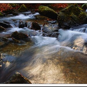
Really like this composition Bitter, especially the colors and the color merge in the middle panel. There seems to be some futzing though in the next. The removal is....... well, let's say not as smooth.
The color was enhanced, yes.
I guess this is my "style" if you will. When I look at things, I look for composition, and hints of color that can be brought out more in PP. I think I changed the WB on this, then increase saturation. This is part of the feedback I am looking for...when do I go too far with it?
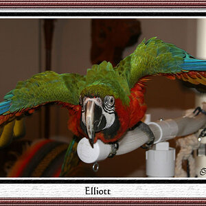
kundalini, I think what you see is reflection in the glass. I should clean that up, huh?
The color was enhanced, yes.
I guess this is my "style" if you will. When I look at things, I look for composition, and hints of color that can be brought out more in PP. I think I changed the WB on this, then increase saturation. This is part of the feedback I am looking for...when do I go too far with it?


")


![[No title]](/data/xfmg/thumbnail/37/37606-3c9ffb5906173fa2aa489341967e1468.jpg?1619738148)