the technical aspects are good, so my only niggles are with the more subjective stuff. So take it as just my opinion based on my own personal tastes.
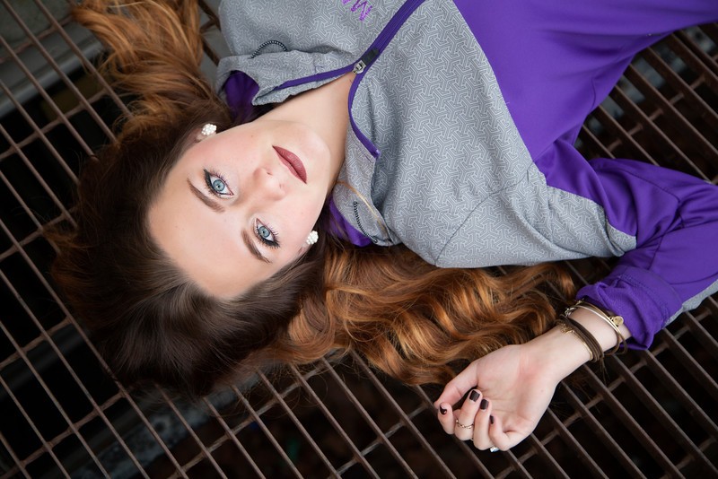
1: lying on a drainage grate? walkway? color, focus and DOF are spot on. not really much else to say. im not normally a fan of tilted images, but i like how this one works here. nicely done.
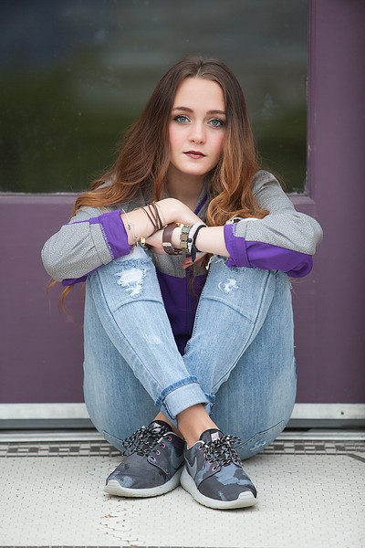
2: solid shot. shame the floors so dirty tho.
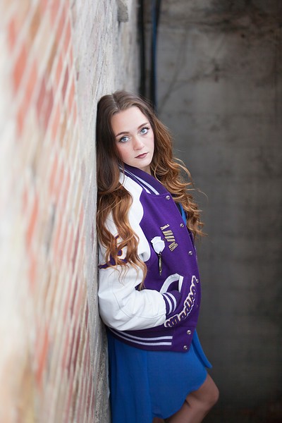
3: not really digging the foreground/background location on this one. or the pipe.
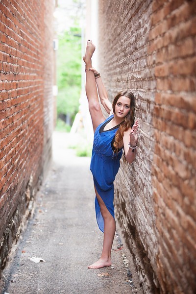
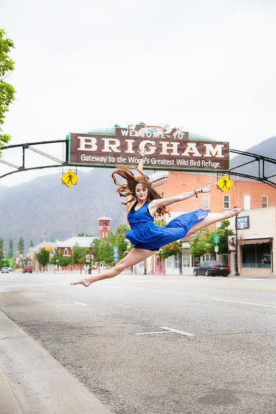
4: this one....just seems like...i dunno...a weird pose for the dress and location. seems out of place to me.
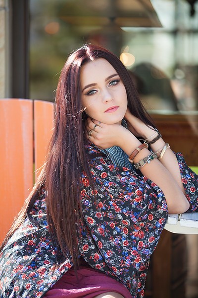
5: brilliant. just brilliant. I think I would crop in a bit tighter though and get rid of some of the blown out space up top and a smidgen of foreground and make her a little more prominent in the frame. otherwise, a perfectly timed shot.
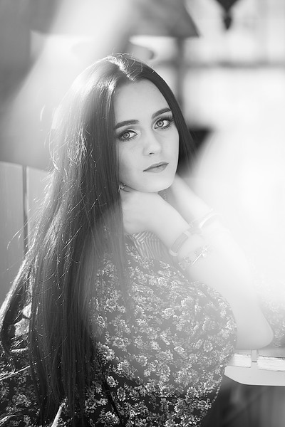
6: this was almost solid gold. I mean, it was right there at the edge of "holy #$&% that shot is great!", but the flare spots kill it for me. Behind the flare spots is an absolutely gorgeous pose and expression. For anyone that likes that sort of flare in their shots, they will need a towel after seeing this one.
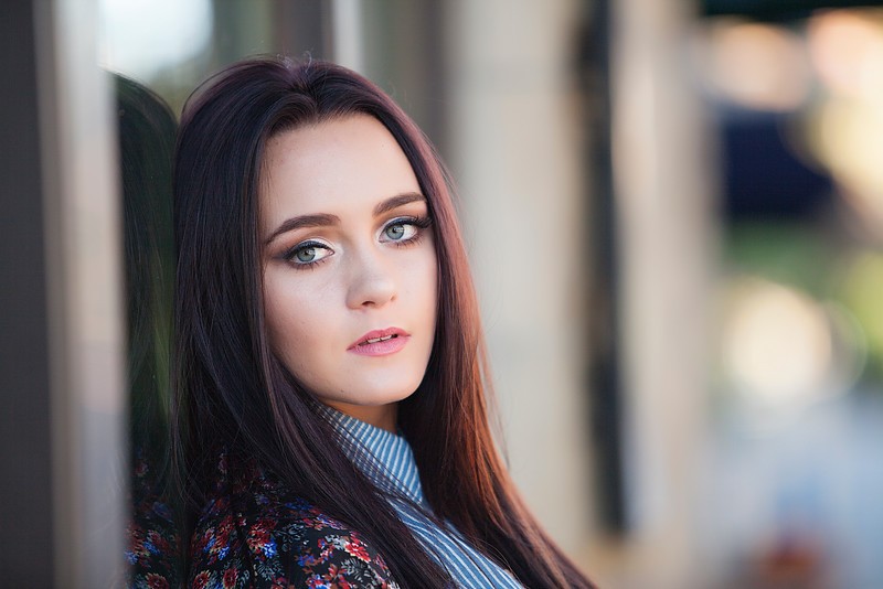
7?: for me, this is what #6 should have been. this shot is beautiful. absolutely beautiful. her expression is wonderful, you simply nailed focus and what I consider perfect DOF for this sort of shot. This is magazine cover stuff.
Awesome, awesome critiques, thank you!
With #2 the floor was dirty, but it's the entrance to a cute little shop right off of the sidewalk on mainstreet, so it's dirty!
#4 is her formal uniform with the dance company she is captain of. They all wear this dress when they dance at half-times!
#5 I think a square crop would be amazing for this one
#6 I'm shooting through the fluer d' lis pattern of a light post. So the flare spots are the over exposed metal... this is the same shot, I just moved in front of the light post. Make this one bw??
")


![[No title]](/data/xfmg/thumbnail/32/32155-5dfb2c8aee58498ba1862d4f34389669.jpg?1734161045)


![[No title]](/data/xfmg/thumbnail/42/42481-e35ff0c514a554d7bd4381fb2ae79c5a.jpg?1734177006)


![[No title]](/data/xfmg/thumbnail/42/42484-fe2beb05d743deaf21681664722538d4.jpg?1734177008)


