Very new, C&C would be nice!

Yasa

TPF Noob!
Joined
Aug 3, 2009
Messages
48
Reaction score
0
Location
Calgary, Alberta, Canada
Can others edit my Photos
Photos OK to edit
Hello everyone,

I'm very new to photography, and while this is only a hobby, I do strive to get better. I have to say, this place can be a very daunting place to start; but that's what I came here for! I've looked at many photographs here and for the most part, they leave me speechless. There is so much to learn here and I can't wait to dive head first into the more detailed threads to improve myself! I bet I could save myself a fortune on classes by just reading the tips from here. Truly an excellent site overall, and seemingly excellent members.

So, like I said; I'm new. I use a Canon Rebel XSi with a 75-300 f/4-5.6 as well as a 50 mm f/1.8. I'm looking to be critiqued fairly hard, as I'm only looking to improve! Here we go;

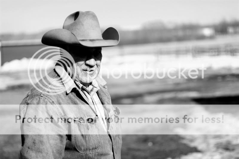
1: This is a photo of my Grandfather, there has been post-photo contrast editing
grandpa.jpg


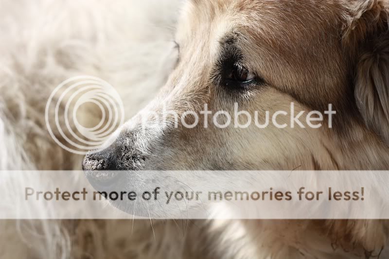
2: This is of one of my grandfathers dog, Bear (again, contrast editing)
bear3.jpg


3: My flight to Vancouver
IMG_3327.jpg


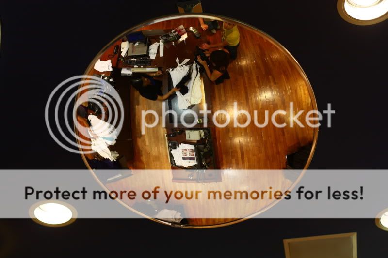
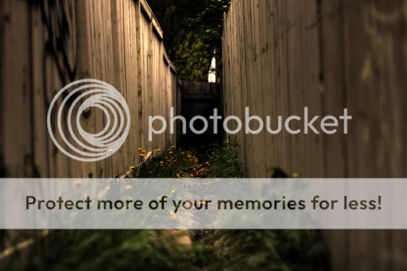
4: My cousin and his girlfriend shopping in Vancouver
IMG_3711.jpg


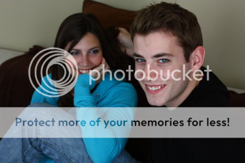
5: My cousin and his girlfriend
IMG_3443.jpg


6:My first and only HDR;
thefences.jpg


I was wondering how everyone felt about post-photo editing such as contrast, saturation, etc. Is this considered bad form, or is it generally accepted as being part of the photography process?

Thanks everyone!
 
#1 you should be able to see his eyes

#4 is pretty cool

#5 is a snapshot

#6 is very good IMO, could have been improved with a bit better focus in the foreground possibly, but I still like the shot.
 
pic one could do with a fill flash, shadow over his face doesn't do anything for the picture. pic two is not good in my opinion, you need something else other then the dogs fur in the bg.
pic three good, especially since your shooting through a plane window. Lastly, pic 5 is too out of focus, it ruins a great shot.

Unfortunately picture 5 was before I was able to grasp proper aperture control. I fully agree with you!
 
#1 needs fill flash. Lots of fill flash. And I mean lots. There's a gigantic difference there. Probably, what, three stops at least? Maybe four or five.
 
Nice shots keep at it, you make good use of proper composition for the most part.

Number six is probably your strongest in my opinion, I just wish the focus could be a bit sharper but I'm not sure how long of an exposure you used.

Speaking from my own experience and school, post processing (pp) is a tool; and as a craftsmen you are a fool to not use every tool properly and when required. The key is knowing when to use certain tools, and generally there should be at the least an adjustment of saturation, contrast, sharpening, and white balance on every shot. Any more then that though is up to you, as well as the circumstance of the shot / style / emotion or mood.

Awesome! I've always been torn between using it or not, and when I do use it; trying to find a balance. When do you draw the line between too much PP and not enough? Although I suppose that depends on the emotion that you want the picture to convey.

As for the fill flash, I will be honest; I've never actually used or understood the technique until now. This is exactly why I came here!
 
The idea of a fill flash is to soften harsh shadows and make what lurks in them a bit easier on the eyes to see. Harsh shadows = distracting / mysterious / emptiness normally. So you look where you have these harsh shadows and apply a very very subtle flash to negate them just slightly and bring some life into them.

The line for me is when you can see the pp. If I can look at a picture and be taken out of the scene or emotion because of the high levels of pp then it is too much. There are times to break the rules though, sometimes too much can be the effect needed to bring life to a shot.

There are ideas like composting where essentially every item in the shot are taken separately and put in there through pp. In these cases darn near the entire picture has been heavily heavily processed to make each piece look congruent and as if they belonged together.

You have to decide where the line is :) it is part of the learning process without a doubt
 
I was wondering how everyone felt about post-photo editing such as contrast, saturation, etc. Is this considered bad form, or is it generally accepted as being part of the photography process?
Photo editing is part of the process, especially if you shoot in RAW. Photography is an art form and you are the artist. You manipulate your photo until you get what you want. In photojournalism the amount of manipulation is strictly restricted, but for the rest of us it's perfectly fine to edit your photo as you see fit. It's part of the process.
 
Actually, the one of your grandfather works on some level (depends on what you're aiming for). Also, he's a great subject.

Shoot some more!

Jon
 
Actually, the one of your grandfather works on some level (depends on what you're aiming for). Also, he's a great subject.

Shoot some more!

Jon

I'm inclined to agree, if it was a color photo then yes, a ton of fill flash would be needed, but for B&W I can look at it and say hmmm, it's more of a mysterious look and adds to the character of the subject.
 
Thank you both! I'd like to say I was trying to go for the mysterious look, but to be honest it just ended up that way, haha.
 
Thank you both! I'd like to say I was trying to go for the mysterious look, but to be honest it just ended up that way, haha.

Ah, but a professional would answer "Yes, that's exactly what I was going for...I planned it that way. Aren't I just brilliant? Here's my invoice." :lol:

Photo editing is totally part of the process. It is bad form (in my opinion) to fix massive mistakes in your exposures (terrible lighting, not exposing properly, not using flash when you really should have, and have one to use), but post-processing can bring that ho-hum image up a little in the "wow" department. But PP should never be an excuse for not learning about how to capture the best possible image you can in the first place (as an example, if you don't know about WB and play with it in-camera, well, you'll never really mess with colour-key shifting, which is just plain cool).
 
Last edited:
I think all 6 of these are great shots and show a lot of potential.

1. This is a good B+W image, but I think the back ground needs to be blurred a little bit. There are a lot of lines that do weird things with the eyes that don't really work IMO. The composition is great! If you were to crop this so he was in the center, then I think you would need fill flash, but as it is, it takes away from his identity. Hes just a guy workin out in the field, and I feel that with the texture (esp. the denim). Including well lit eyes would take away the harshness of the sun and would make the eyes the focus point of the photo, instead of the personality/persona portrayed.

2. Yay dogs! Great light in this one again. Might try it in black and white or sepia, since color isn't doing a whole lot for this photo.

3. This sunset works for me. The only thing I can argue is that you might crop the left side of the frame to get that little blip beneath the wing out. Kind of distracting.

4. A good way to look at a pretty typical activity.

5. Yes this is a snapshot, but its a good one, with nice lighting. IMHO if the girl was in sharp focus, it would be even more snapshotty. The soft focus gives you a clear subject, the guy looking at the camera. We know he is the subject because he is the one looking at the camera and she is looking at him, but the smaller DoF helps our eyes see that as well.

6. This photo would work if the foreground was in focus. Its pretty good HDR- not completely obvious and doesn't scream PP!!!! but enought that it gives the shot a feel of its own. But the out of focus foreground detracts from the picture and confuses the eye.

As for the how much PP is too much PP, that's a personal thing, something you have to decide. Personally, anything more than messing with contrast, hue, saturation, levels and the like is too much for my own taste. I don't want to look at a picture that has obviously been edited extensively. For me photography is about putting myself in the picture, and believing it. I can't do that if I can't buy the realism of the photo. Also part of the joy of photography is getting out and capturing a moment or a feeling, not sitting at my computer for hours agonizing over technicalities. But that's me, and plenty (if not most) of people feel differently.

EDIT: I just read what musicaleCA said about PP and I entirely agree. Too many people use PP as a way to correct bad photography to begin with. Its photography, not graphic design.
 

Most reactions

Back
Top