Veteran's Portrait Project - C&C Appreciated.

tirediron

Watch the Birdy!
Staff member
Supporting Member
Joined
Jul 8, 2005
Messages
45,747
Reaction score
14,806
Location
Victoria, BC
Website
www.johnsphotography.ca
Can others edit my Photos
Photos OK to edit
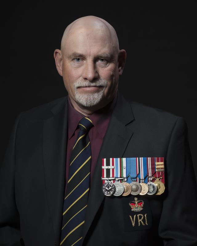
Another session for the Veteran's Portrait Project

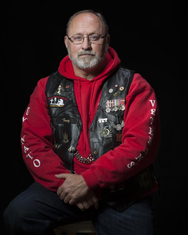
Sgt. Tracy Barton, RCAF (Ret'd) - Canadian Veteran's Motorcycle Club

VPP3.jpg
 
Its a nice shot. His face is kind and thoughtful. For some reason, the placement of his hands bugs me a bit. This isn't criticism, as I don't know enough about portraiture to comment. It seems to pull my eye down from his face a bit.
 
I like it, its cool, only thing i would have done is put him more to the right. Nice lighting
 
on this crappy computer it looks a bit underexposed, but no one has mentioned that so probably it is ok.

crop- did you try another crop. To me, it's too wide, there's too much space on the left
 
Its a nice shot. His face is kind and thoughtful. For some reason, the placement of his hands bugs me a bit. This isn't criticism, as I don't know enough about portraiture to comment. It seems to pull my eye down from his face a bit.

My eyes were drawn to his hands too. Not sure why. They do appear to be darker than his face which makes sense since you are lighting to focus on his face not his hands. Otherwise it is a nice portrait.
 
Its a nice shot. His face is kind and thoughtful. For some reason, the placement of his hands bugs me a bit. This isn't criticism, as I don't know enough about portraiture to comment. It seems to pull my eye down from his face a bit.
Ruh-roh....

I like it, its cool, only thing i would have done is put him more to the right. Nice lighting
Thanks! Could you explain why the positioning?

on this crappy computer it looks a bit underexposed, but no one has mentioned that so probably it is ok.
crop- did you try another crop. To me, it's too wide, there's too much space on the left
No I didn't; did you mean image left or his left? I deliberately left this one a little wider (while still cropping to 4x5) because of the position of his elbows. When I came in tighter, they were 'bumping' the frame.

Its a nice shot. His face is kind and thoughtful. For some reason, the placement of his hands bugs me a bit. This isn't criticism, as I don't know enough about portraiture to comment. It seems to pull my eye down from his face a bit.
My eyes were drawn to his hands too. Not sure why. They do appear to be darker than his face which makes sense since you are lighting to focus on his face not his hands. Otherwise it is a nice portrait.
Hmmmm... two comments on the hands; to be honest, this was his natural placement and I thought it worked well, so I didn't change it, but if you could elaborate more on why they're pulling your eye, I'd appreciate it. Would burning them in a bit help?
 
I like the descending lighting on this. It draws more prominence to his head and decorated vest, and a little less to his hands, waist, and legs. Its almost a "full body shot", but turned into a "half body" shot with the lighting. Very cool.
The color is great here. The black vest really stands out well against his red sweatshirt, which in turn, stands out well against the black background. (my personal favorite background) Im good with the crop here. any tighter and you would be close to clipping his head and elbows.
I dont really see any issues with his hands either. The lighting keeps me drawn higher, so i don't find the hands distracting.
 
^^ what pix said. I love the lighting from the top.
the cropping looks good because of the knee positions.

and I think I know what they think about the hands when I inspect the concept. The hands and face are directly vertical of each, and the same color (though less light). All the other colors, vest, shirt etc are darker and not even close to his skin color, so one kind of jumps to his hands. But I'm not sure if it's his hands or the gold thing from his vest just above his hands.

but i'm just a newbie at lighting .. so take with a grain of salt. :)
 
What were you trying to accomplish with the lighting setup?
 
^^ what pix said. I love the lighting from the top.
the cropping looks good because of the knee positions.

and I think I know what they think about the hands when I inspect the concept. The hands and face are directly vertical of each, and the same color (though less light). All the other colors, vest, shirt etc are darker and not even close to his skin color, so one kind of jumps to his hands. But I'm not sure if it's his hands or the gold thing from his vest just above his hands.

but i'm just a newbie at lighting .. so take with a grain of salt. :)
Excellent analysis! Thanks - I think you've nailed it.

What were you trying to accomplish with the lighting setup?
This is part of a larger series I've been working on which will all have a similar appearance. The idea behind the lighting (gridded BD high & left) is to light the face and accoutrements, but to keep the rest fairly dark. What I want to do is accentuate the face and anything that says "Veteran". In the case of this one from a previous session, it's his medals and regimental crest:
VPP_2_Small.jpg
 

Most reactions

Back
Top