Vintage Train Station Portrait: Impossible Whites (CC)

How does this look?

Also, what? I think your wife is beautiful, especially with that smile.

7767573854_04e245d618_k-2-1.jpg


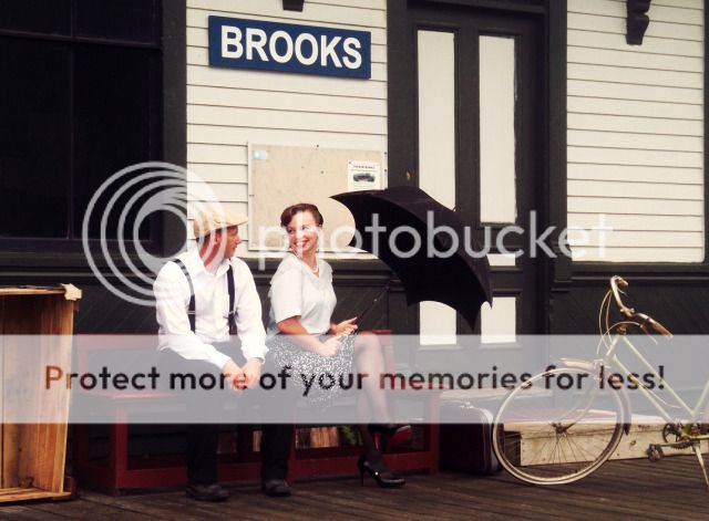
Here is the original color treatment with the (hopefully) whiter shirt.
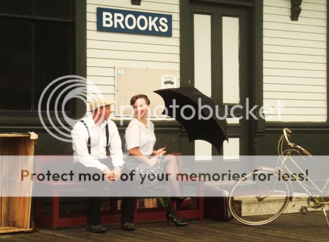
7767573854_04e245d618_k-3.jpg
 
Last edited:
Making the brights less so; same with darks, desat a bit, adding sepia and burning the corners gave it a bit of an old-timey look.


776757385404e245d618kll.jpg
 
$7767573854_17c4e92826_z.jpg

But how was it done? Unfortunately, not in Photoshop. I applied an HSL curve in Photoline32, dropping the lower saturated colors lower while leaving the unaffected colors. I then masked out the darkest colors such that the sign and trim remain saturated.

It can be done in PS using Hue/Sat, though the tool isn't as precise. Sample the wall, desaturate and create a mask from the shadows by duplicating the image, adjusting in channel mixer leaving only the darker colors as dark as possible, then boost contrast in curves so that only the trim and what not remains, iirc control-shift-v is the shortfut to paste into a mask in PS. Touch up with a brush:

$No name.jpg

OMG. I actually posted something helpful.
 
Last edited:
Hi Farmclicker,

First of all, I agree with everyone above. This is a very nice photo. I really appreciate the work you put in to staging it and the vision that went into it.

I do see what you mean in that the brightness and whiteness of the shirt draw the eye to you more that should be with such a pretty person sitting next to you. But this is a very minor thing.

I hope you don't mind my attempt at an edit to try to "fix" that.

I decreased the exposure over your shirt and tried to add an off-white tint to it. Then I did a bit of white balance changes to decrease the yellows a bit, though I could have just played with the yellow saturation. (I'll have to try that next).

I did a bit of noise reduction as well.


7767573854_04e245d618_k.jpg by Javier Descalzi, on Flickr

Edit: I didn't see page 2 of this thread. Well, there's another version of the photo.
 
Like everyone else your wife's blouse color is not an issue. I did remove the color so you could have a look. Your series might also look great as B&W or sepia.

mmu8av.jpg
 
So I think the whites are fine the way they are... in fact, they shouldn't be totally white, IMO.

If the picture looked perfect, it wouldn't look vintage enough... again... IMO.

Aging photos is sort of a mini-fascination for me. Try this on and see what you think...

7767573854_04e245d618_k.jpg


I'm not totally happy with the edges, but this was a quickie. :)
 
I appreciate everyone's input on this photo, as I have said before I recognize that it takes time to manipulate photos and in this day and age, time is a very valuable commodity. So thanks for all the versions.

I also appreciate the kind words regarding my wife. While she is beautiful outwardly, I must say she is truly a beautiful wife in all aspects of things. The man she was with before was really something else and it is amazing the hurt and baggage that can come from being constantly put down for 10 years. I think I became her husband just so that I can make her feel good about herself again. Obviously flattery is another form of lying, but by seeing the best sides of people...and telling them that routinely, goes a long way in restoration of someone's self esteem.

It is the same way with constructive criticism of photos and the majority of people on this forum do it kindly, constructively and appropriately. I really appreciate that. Thanks from all us hobbyists!
 
A lot of these old-timy edits make it look like a "black and white but color", I'd say try to make it look more like a kodachrome, with strong bright whites, deep black shadows with a sharp roll-off, and saturated warm colors.

This period looks more like 1956, than 1906, and I think should be treated similarly.
 
unpopular said:
A lot of these old-timy edits make it look like a "black and white but color", I'd say try to make it look more like a kodachrome, with strong bright whites, deep black shadows with a sharp roll-off, and saturated warm colors.

This period looks more like 1956, than 1906, and I think should be treated similarly.

Oh I forgot to b/w it! Lol
 
Well this is what it looked like in 1930 I guess. They stopped running steam trains and went to diesel only in 1950. By the look of the car, and assuming it is considered modern when this photo was taken...and from the power lines in the picture, I would say this was taken in the 1930's. I only live 5 miles away and we did not get power on this farm until 1956.

This view is looking in the opposite direction then all of the ones I took, but you can see that a lot has changed. The freight station is gone, but the train station itself stayed much the same for the last 80 years including the semiphore signal in the photo.

BMLNo-4.jpg
[/IMG]
 

Most reactions

New Topics

Back
Top