A trained or learned photographer always tend to dissect and analyse; this mostly happens, when the image at the first look did not appeal to him; ...and i think the analyses made here have logic too. They are not just cynical i feel. I am not a trained or much learned photographer; yet i am keen to learn.
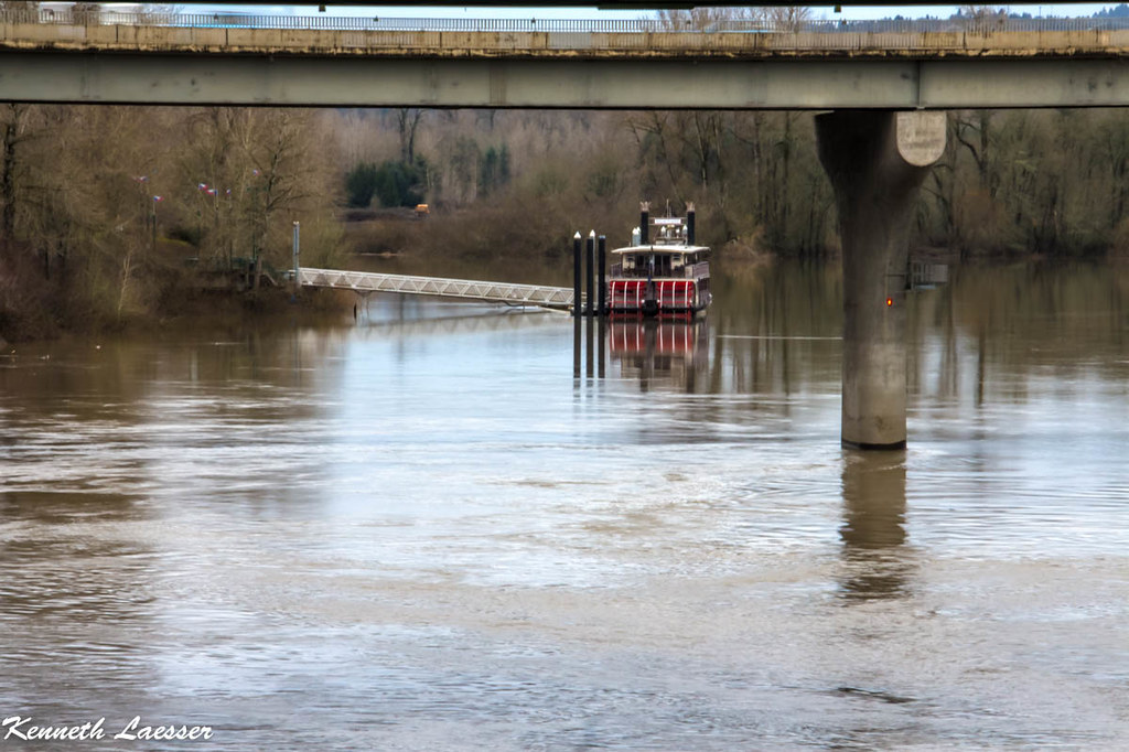
I like many elements in this photograph; but as a whole it has some compositional problems too. If this image has sufficient pixel density, the rectangle portion, below the bridge with bridge pillar and upper part as limits, but completely excluding the bridge will be a nice choice....

This is your image and any segment from it also yours only

PS: then the caption would need a change too


![[No title]](/data/xfmg/thumbnail/37/37092-c446ffb89610a57384a51ac5254beffd.jpg?1734169827)
![[No title]](/data/xfmg/thumbnail/37/37094-a3c300cd42f78d01d01fe80c1233002e.jpg?1734169827)


![[No title]](/data/xfmg/thumbnail/30/30868-01a498267fd96ce5b2d98347458d3903.jpg?1734158842)
![[No title]](/data/xfmg/thumbnail/34/34061-e097813b3719866d07ff3e78e8119ffa.jpg?1734164477)
![[No title]](/data/xfmg/thumbnail/35/35215-cb01ff31834a4ee952045622f00781a5.jpg?1734166876)
![[No title]](/data/xfmg/thumbnail/30/30867-a58aa3d7c15d0b48498a201af3a68a8f.jpg?1734158839)