What's new

Website view 1 of view 2? Give me ur opinions

MohaimenK

TPF Noob!
Joined
Nov 13, 2008
Messages
2,583
Reaction score
11
Location
In between her...
Can others edit my Photos
Photos NOT OK to edit
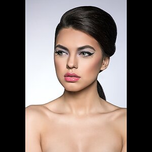
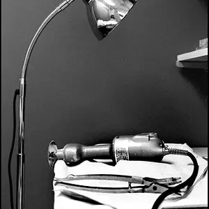
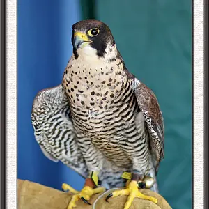
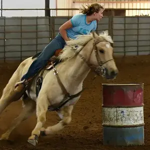
I'm making it right now. The color or the BW??

5271856697_8822c4ee25_b.jpg


or

5271856755_6c8347ae47_b.jpg
 
I like the color :)
 
First of all... nice. :thumbsup: I like them both. Being a fan of B&W.... I am still leaning towards the color option.

However, I would ask myself whether I do better business in Color or B&W? Do you want to focus/promote one or the other, or both?

Perhaps have a combination of the two...
 
I too like the color more for the main page.

As for pictures, I do both. The galleries will have a mixture of both color and BW and that's how I want to market my business and promote it.
 
Maybe you should put the engagement gallery first in color, the wedding gallery in the middle in B&W and the portraits last in color. Like bus rider said have a combo of the two.
 
Maybe you should put the engagement gallery first in color, the wedding gallery in the middle in B&W and the portraits last in color. Like bus rider said have a combo of the two.

Ohh no, I don't want to mix it in the main page. The other thing I was thinking was maybe making them B&W and when you hover your mouse on them, make them color. OR make it color and when you click on it, it'll change to B&W

Yeah, I think that would look really nice :thumbup: I still think you should put the engagement gallery before the wedding gallery though :-P
 
Clean and simple are best. Most people want if not all, then at least a majority of colour images from their event, therefore I would stick with the colour version. The colour images also contrast nicely with the simple, greyscale background, giving the page a clean, professional look.
 
I was going to recommend B/W and then change to colour when hovered overtop of for the element of refreshing surprise. Glad to see that you put that in your post.

Great looking website. Having hover functionality will make it even better!
 
No-brainer.

Color.
 
just the main website is up but non of the links are working so far. check it out. I might do the hover from color wo B&W
 
Whats the link?
 
I like the design. My only concern (?) would be that you have to scroll down to see the full images. I'd be asking myself if I should make the pics smaller so they are not so long vertically so that you see them in full when you first hit the page. I think they could be an inch smaller all around, and maybe spread out just a bit more between the three.

But I don't know that is important. I like the site. Honestly not as many really good photo sites out there.
 

Create an account or login to comment

You must be a member in order to leave a comment

Create account

Create an account on our community. It's easy!

Log in

Already have an account? Log in here.

Back
Top Bottom