weekly contribution. C&C please

sburatorul

TPF Noob!
Joined
Jul 2, 2008
Messages
369
Reaction score
1
Location
a place few people heard of
Can others edit my Photos
Photos OK to edit
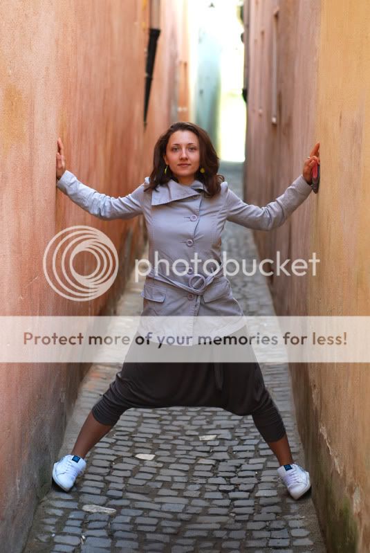
supposedly this is the narrowest street in Europe.
adrianapestradasforii.jpg

shot with my fav, the 50mm at f2.8, 1/100s, iso 100
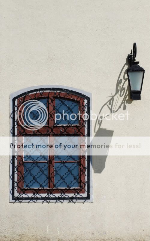
window
fereastra.jpg

50mm, f2.8, 1/4000s, iso 100. it was bright sunny. i wish i could shoot it at the other end of the day but its in a city 600km away. i will eventually
 
Both of them are great shots. The first seems as though it may be a little bit underexposed, and the 2nd i agree shooting at a different time would help a lot with that shadow or maybe when its fairly over cast. I love the composition of the 2nd one though very interesting window. Good job, thanks for sharing
 
wow. and i even thought to darken it a little bit. stands to show how much i need a monitor calibrating spider.
 
I like both photos. However, on the first one, it does seem slightly underexposed and for me, I would like the face to be slighly more in focus. As for the second photo, I agree about the shadow. Maybe you can remove it with photoshop.

Overall, both are really nice. :)
 
i tried removing it but it looks weird and plain with no shadow.i think having some shadow gives it shape. thanks for the comments.
 
I really like the first one. I think the exposure looks fine..maybe a TINY bit underexposed, but I think it's great. The only thing that I don't like about it is her outfit (petty, I know) but the tennis shoes with the pants/skirt and the trench coat just look kind of funny. I am SO sorry and I hope it isn't YOU in the picture and I'm tearing your outfit apart. I know you were traveling and had no control over the outfit, but it really is my only gripe. The picture itself is nice. I like the lines and I like the stance. Fun.

The second picture is lovely and I actually like the shadow. It looks to me like the light is reaching down to touch the window. They are holding hands like old friends :)

Great work!
 
You have them hosted on photobucket. I've noticed PB making my images look significantly darker and it's very annoying - it may well be that they look fine on your monitor.
 
I like the window a lot... I wish there was more visible texture to the wall, but still very nice. (maybe bring the exposure down a hair if you have it in RAW?)

The shot of the woman in the narrow street is amusing, but doesn't strike me as photographically exciting.
 
thanks for all the comments. don't worry is not me, is one of my colleagues and it was spontaneous so no control over the outfit. i will try hosting them on flickr see if there is any difference.
 
I like #1, but as others have said, maybe a little brightening is in order. Very interesting shot and nice composition.

#2 is an absolutely great photo in my opinion. I think an experimentation with maybe making it B&W may be in order here. Or maybe not.

On another note, your colleague is very pretty--maybe you can convince her to do some more formal portraits with that Nifty Fifty of yours.

Great work! Keep it up.
 
We call those "alleys". :)

Fun pic.

i know what you mean. i see it as an alley but for some reason the officials call it a street. i think it has some historic importance. i'll look into it.

there is no need to convince her. she loves to pose so I'll be sure to take some more photos. she also likes to be behind the camera which is not quite ok with me since in that case i would play the subject role.
 
#1 has been thoroughly discussed and I agree with the underexposure comments. I personally think #2 is a good shot thanks to the shadowing from the lamp. The lines the shadow creates are great, and without them this would just be a photo of a lamp and a window. I will say that this probably needs some context to make it stronger, meaning that this should be part of a series (maybe 3 shots) that would better explain it's purpose. Overall, they're nice shots and you look to have some nice shooting locations over there.
 
thank you all for the comments. since all mentioned the first one to be underexposed i brought down the lighting of my monitor a notch and processed it again. here it is
adrianapestradasforii-1.jpg


as luckyso suggested. here is the black and white version with a little vignette.
fereastra-1.jpg
 
#1 looks better after your second processing attempt. I thought it underexposed as well. I love the colors and the pose, but have to agree with the outfit. All I could think was, hmmm... what do they call those pants? lol, but what can you do? She is beautiful!

#2 I enjoyed much more in color. You're first post is great, I think the shadow adds something interesting and I don't think I'd like it without. If you turn it b&w, you lose that great blue and brick coloring from the window which I love against the stucco background.

Love these! I've gotten some inspiration from you. If only the buildings in Midwest USA were as beautiful! Hmmm... I guess I'll see how I can spruce up the farm fields and cow pastures close by.... ;)
 

Most reactions

Back
Top