CyclonePWR
TPF Noob!
- Joined
- Dec 25, 2008
- Messages
- 133
- Reaction score
- 0
- Can others edit my Photos
- Photos OK to edit
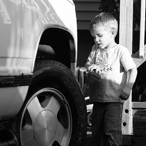
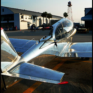
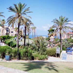
Not sure much about the first one.
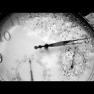
But I actually like the second one in B&W. Do you guys think it might have looked really good as more of a high key photo.
But I actually like the second one in B&W. Do you guys think it might have looked really good as more of a high key photo.


![[No title]](/data/xfmg/thumbnail/32/32007-77c44b6b6edb5db977381096a2ffe54b.jpg?1734160805)