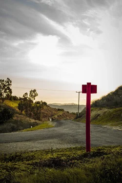
For ME, the red sign, power lines, and the blown out white sky take away from the photo. As far as it being a "wall hanger" that is. However it isnt a bad photo by any means. The location looks really nice, I'm sure you could get some better shots!
I agree with Parker about the power lines (not much you could do about that) and the red sign doesn't sit too well...Maybe a few steps to the right to move that sign to the right edge of the frame would keep it from breaking up the composition... But I LOVE the colors in this shot. Its a keeper!
The red sign makes it for me. There are some very "pushed" feeling parts of the exposure, but I love the flash hitting the sign and the contrast with the green and the sky. I also love the high contrast look in the road, grass and sign.
I tend to agree with the others. The power lines and the pole in the background are a distraction from your main subject - the red sign. As well, the sky is washed out. Compositionally, the red sign grabs the viewers eye and then the road leads it into the hills in the background - too bad about the power lines. If you know Photoshop, there is functionality in the newer versions called "Content Aware Fill" that will give you the ability to remove the power line and the pole.
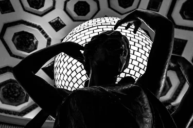
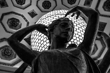
This isn't exactly landscape or cityscape but i wanted to keep this thread going. I really enjoy black and white photography. But i need help on how to find that balance between the blacks and the whites. Here is a picture that i think i did well on, but i would still love to get feedback from you. Thank you!
I think the B&W would be better if we could see more detail in the statue rather than the hint of detail that we see now. Not sure if that is possible, maybe you can dodge the statue a bit.








![[No title]](/data/xfmg/thumbnail/35/35262-02f8eba4a2a92dbae0b55547bba80b4f.jpg?1734166920)



![[No title]](/data/xfmg/thumbnail/35/35870-e324e80cd11d99176357e12cd2ba3b8a.jpg?1734167596)
![[No title]](/data/xfmg/thumbnail/36/36644-d48bde7a35945a119c05c18e8c748c27.jpg?1734169161)