Everything that follows is only my opinion/belief/whatever but its typical of the way I try to handle my pictures.
Any picture has either one center of interest (coi), the thing that you want people to look at - or it has several but they
must be related in some artistic or compositional way.
If you have several that are unrelated the viewer doesn't know what to look at or why.
So the photogs job is to create an image that clearly signals to the viewer what is important in the photographer's eyes and why he/she has taken the picture. Everything in an image needs to exist in a hierarchy with the COI(s) at the top and the other stuff subordinated.
When viewers look at a picture, they come with no preconceptions, anything that is there the photographer included and they try, unconsciously to get the hints and clues that the photgrapher leaves to understand what they need to look at and think about.
Viewers are attracted by bright lights and bright colors,
Viewers look for things in things in the powerful positions (like the thirds); conversely something that is near the edge or cut off is less important (unless the photog is skilled enough to be using that as a device)
Their eyes follow lines.
If something is whole, it is more important than if it is chopped off (unless, again, the photog is skilled enough to be using that as a device)
SO the job of the photographer is to decide what he/she wants the viewers to look at and then accentuate those CsOI and diminish the attractive power of the distractions.
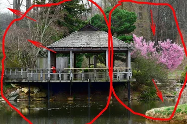
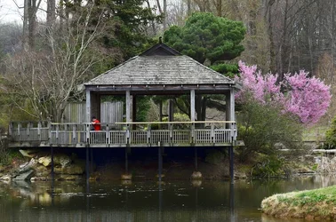
If one looks at your original scene through the eyes of a new viewer, what does he/she see?
A bright corner at the upper left
A virtual total little scene at the right with the entire tree included, so it must be important, with some water and landscape in front of it.
On the left another scene, interesting but in a different way and essentially unrelated artistically - different mood, different subject.
Because of the way they sit side by side - which one is the important one isn't clear. Oh, you can intellectually figure out that maybe the boy with the red shirt is the COI, but the other things also pull the eye too much.
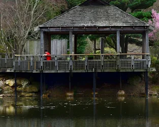
The scene at the right is much less interesting so we can diminish its importance cropping it.
The scene at the left is much more interesting visually, that bright shirt and the person looking into the dark water - but he is surrounded by bright wood with lines that lead away from him off into nothing important - so the tree and the wood of the building can be darkened, the corner can be darkened and he can be placed in a thirds, powerful spot where there isn't anything particularly competing with him for the viewers' attention.