What's new

What's missing here?

Color depth? Variance?

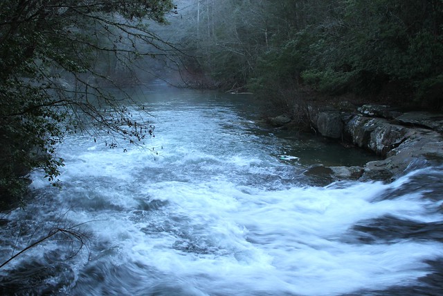
It seems like it's all just similar colors, only in different shades. If the scene was actually lik that though, then I don't know how to fix that. Unfortunately, sometimes scenes the scene that seems spectacular and worth of rememberance doesn't translate into a 2-D photograph very well. :(

I also think that the composition is kind of strange. I mean, I understand what you were trying to do, but I just don't think that the lens you used was wide enough to effectively capture both the scenery farther down the river as well as rapids in the foreground. :(
 
One thing missing is detail in the whites. And as rexbobcat pointed out, the image does not have a lot of variation in color or tonal values between the elements in the shot...it all sort of blends together. I also do not like the way the whitewater looks rather greenish-blue...I dunno...the lighting before sunrise is so,so "flat"...I think it's actually better to wait until the sun is higher, and to shoot then, and then revise the images to look more like this...

Is that cheating???

 
I agree with the colors being a bit dull. Even though it was a dull, dreary day, it's best to have a bit more color variance in the photo to keep it interesting. I warmed it up a bit (though it's still quite cool) and also cropped out some of the water at the bottom, which was very bright and a bit distracting. It looks like a fascinating area though, and I'd love to see what you can come up with there! If you can go to this location and wait for some wildlife to show up (a deer, heron, etc.), that might give the scene a very defined subject.

2poa545.jpg
 
Stated another way, the lighting in the image is flat. There is little contrast. People like contrast.

It has a blue color cast, which may well be from the white balance setting you had the camera on. Your Flickr is 'Private' so no one can see the EXIF data for the photo.

I really dislike the way Flickr hosting works.
 
Thanks for the input. I agree with all that everyone said. It was dark there but I was trying to see if I could salvage something. All I have to work with is DPP and I haven't gotten into GIMP yet.
I did manage to come somewhat close to Natalie's edit though. Much better.
I still like the mood of it though.
Thanks again for the input.
 

Create an account or login to comment

You must be a member in order to leave a comment

Create account

Create an account on our community. It's easy!

Log in

Already have an account? Log in here.

New Topics

Back
Top Bottom