yardism
TPF Noob!
- Joined
- Dec 16, 2007
- Messages
- 87
- Reaction score
- 0
- Location
- San Jose, CA
- Can others edit my Photos
- Photos OK to edit
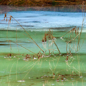
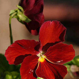
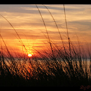
Here are a couple of shots I took trying to capture water droplets. C&C welcome.
#1

#2

#1
#2