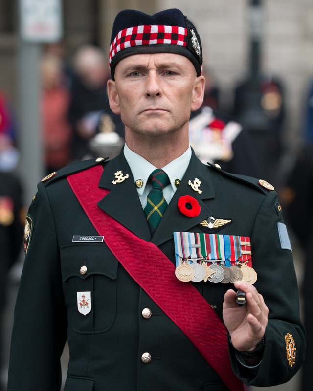
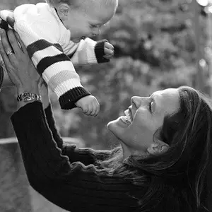
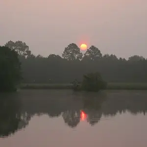
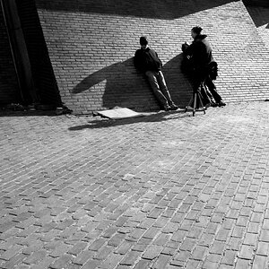
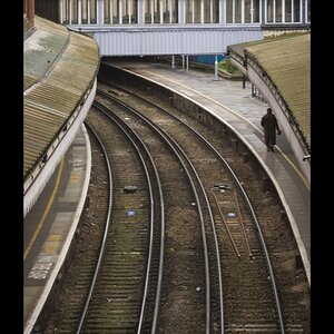
I like better that the first one shows the setting because it seems significant to the image. The second one makes him too crammed in the frame, maybe because it was cropped so you could sort of see the background but not really so I'm going, what's back there exactly? (Even though I know from the first picture, if that made sense.) I seem to often want something in the frame or out, not partway in.
The third one's not bad if you want a close up portrait of just him because not enough of the background is showing to be distracting. The first one makes more sense because of what he's wearing; it puts the kilt into perspective I guess (because here those are rarely worn so it would make me wonder why is someone wearing a kilt?). I guess it's somewhat what you bring to the photo as a viewer. And how/why you're going to use the photo.