Which do you prefer..PP c&c thanks!

linpelk

TPF Noob!
Joined
Jan 1, 2009
Messages
406
Reaction score
0
Location
California
Can others edit my Photos
Photos OK to edit
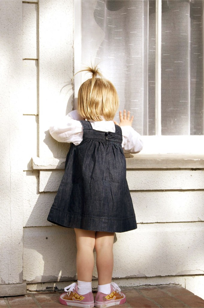
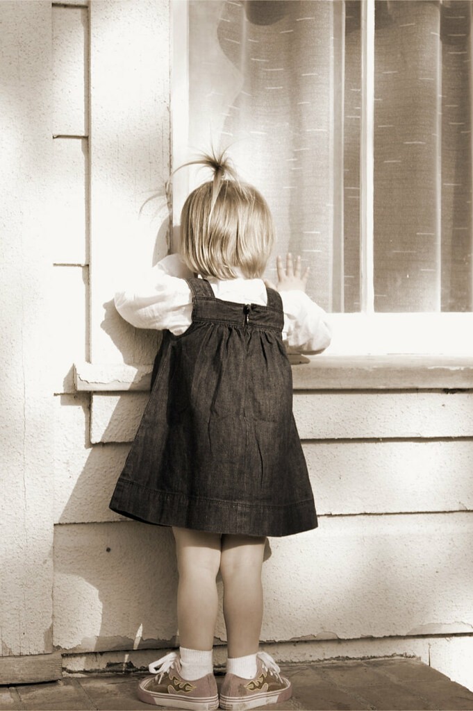
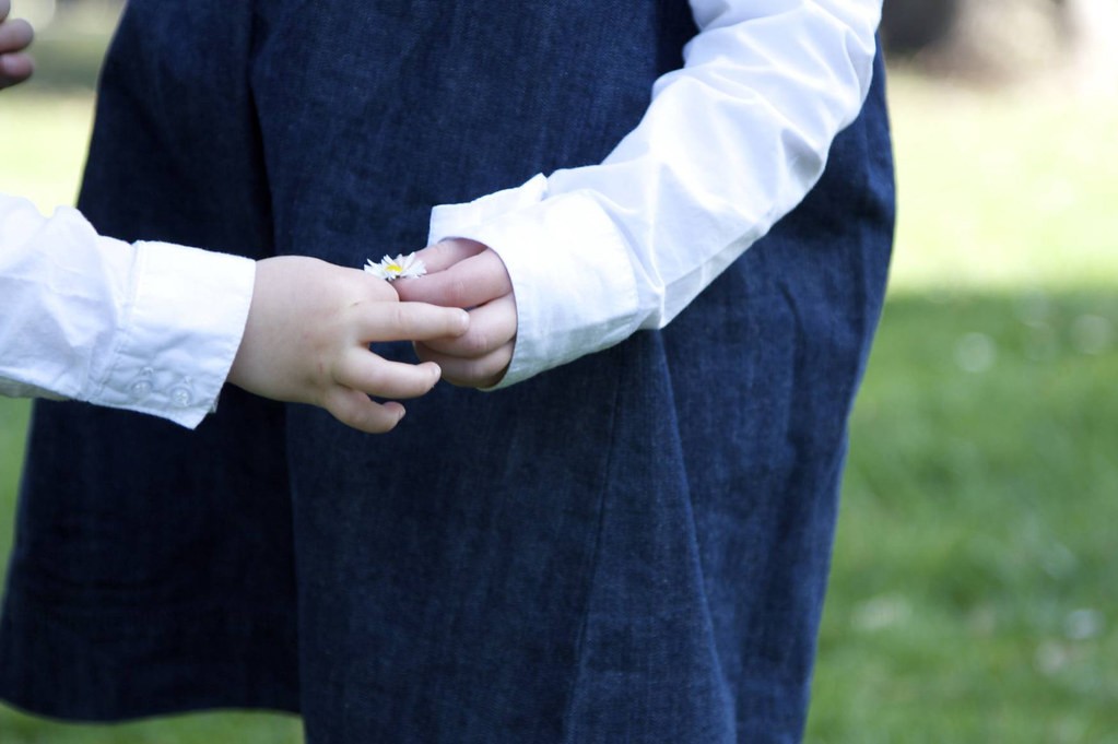
I just got Photoshop cs4 a couple of weeks ago. I've never used it before and I'm making my way through the Scott Kelby book(in addition to lots of YouTube videos), but in the meanwhile I'm super excited about new ways I am seeing my pictures. I've only had aperture so you can imagine how cool all of the effects are for me (i.e. free actions I've downloaded...ok, I hear all of you professionals gagging) I realize that people new to PS tend to overdo it and I promise it will only be for a short time, but I was wondering if you could tell me which of the following of the two options you prefer (if any). Also, what do you think of the photos themselves. Thanks so much!
1a
3386932866_f57bc1e2db_b.jpg


1b
3386932994_94bce9eb22_b.jpg

2a
3386933140_99dc215e80_b.jpg


2b
3386121217_858a4cb6e5_b.jpg

3a
3386933338_b7e360cde8_b.jpg


3b

3386121381_243a0cc2d9_b.jpg
 
I just got his book too and am loving the fact that I can now use Bridge effectively to manage my files (only chapter I've gotten through yet). Anyways, your first shot is out of focus and I'd quite like the look of the 2nd option if it were in focus(like an old school picture in my grandma's photo album). The second shot looks better in the first option, if you're going to desaturate the color that much, you might as well go B&W. The third shot however, I don't think either work well. The first lacks saturation, and the second looks strange with the blue. Not sure what to recommend as the shot itself looks limited on color but this may be another that works better in B&W.

I'm really looking forward to improving my post production too, hopefully this book helps. What process did you use for the antiqued look of the first shot?
 
imho the second image is the better of them but there seems to be a lot of blown highlights. perhaps darken the highlights a bit to see if you can bring back some detail
 
2a is better than 2b because the cute feet make the picture!
 
2a is better than 2b because the cute feet make the picture!

I personally like 2a because of the shoes too which is why I went with desaturation rather than B&W. I wanted the color of the shoes to show, but didn't really want the picture in full color.


3387252579_4a588821f8.jpg
 

Most reactions

New Topics

Back
Top