
- Joined
- Mar 18, 2013
- Messages
- 15,468
- Reaction score
- 15,380
- Location
- Boston
- Can others edit my Photos
- Photos OK to edit
Learned a new editing technique and tried it out on some photos from this weekend after I had edited them with my "old" way. Which do you prefer? And why? Also open to any critique for improvement on either photo.
1.
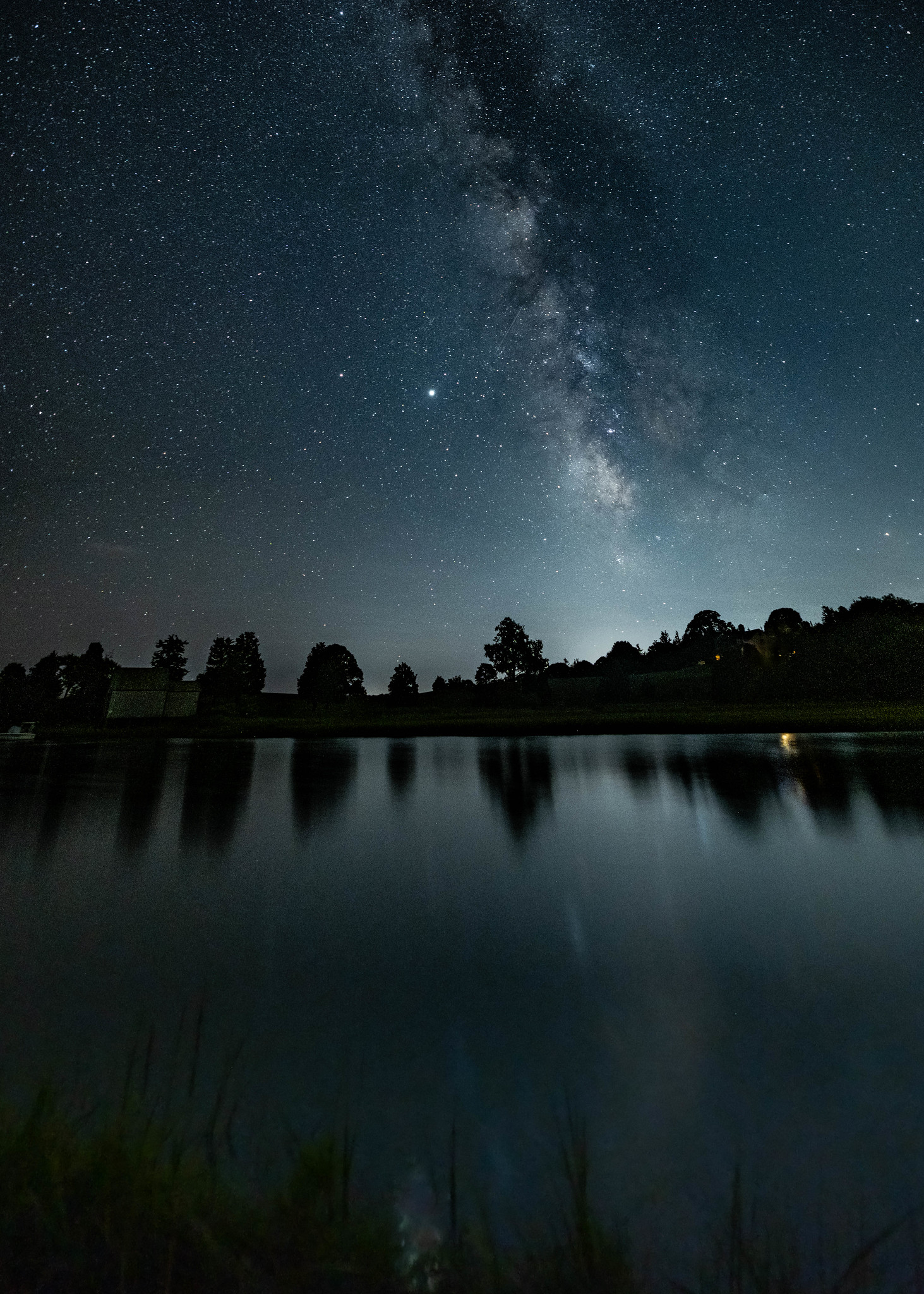 star gazing at the salt marsh by SharonCat..., on Flickr
2.
 Salt marsh pano 3 by SharonCat..., on Flickr
1.
star gazing at the salt marsh by SharonCat..., on Flickr2.
Salt marsh pano 3 by SharonCat..., on Flickr salt marsh milky way 3
![[No title]](/data/xfmg/thumbnail/42/42253-fef7e43227f484b1a95dd6d85c03bd40.jpg?1619740063)


![[No title]](/data/xfmg/thumbnail/30/30987-a33ca8e90b5d786c21e59d37945b9cc6.jpg?1619734552)