What's new

Which one would you recommend for my website? Need some feedback please.

Whcih one should I put on my website


  • Total voters
    14
  • Poll closed .

Tight Knot

No longer a newbie, moving up!
Joined
Nov 30, 2010
Messages
1,398
Reaction score
159
Location
Boca Raton, FL
Can others edit my Photos
Photos OK to edit
Hi all,

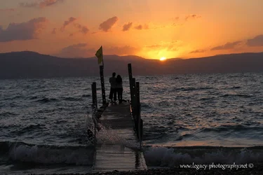
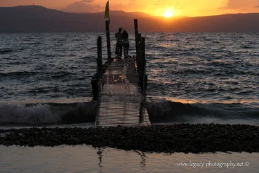
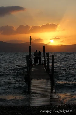
I'm not sure which of these images should be on my website, and I'm looking for your opinions (on which ones, and why, or why not).

Thanks in advance.


1.
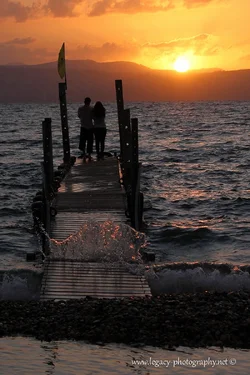
$Couple standing on a dock on the Kinneret at sunset with wave splash - 2.webp


2.
$Couple standing on a dock on the Kinneret at sunset with wave splash - 3.webp


3.
$Couple standing on a dock on the Kinneret at sunset with wave splash.webp


4.
$Couple standing on a dock on the Kinneret at sunset.webp
 
I like #3. Looks different. .I don't know if the little rock's qualify as foreground. But it's good

Santosh Rane
 
I personally prefer the last image. They're all great, but I think the sky in that one makes the shot.


Sent from my iPhone using Tapatalk
 
4 for me. I find the bottom of the shot best anchored in that one. I also found the water coming up through the dock a little distracting in the other shots as well.
 
4 for me. I find the bottom of the shot best anchored in that one. I also found the water coming up through the dock a little distracting in the other shots as well.

Thanks deeky
 
#4. All of the images seem to have a slight lean to the left; the lean in #4 seems less pronounced to me. I'm also a sucker for those sun rays -- I forget what they're called, but I like 'em. Image #1 would probably be my next choice, especially with a little bit of straightening.
 
#4. All of the images seem to have a slight lean to the left; the lean in #4 seems less pronounced to me. I'm also a sucker for those sun rays -- I forget what they're called, but I like 'em. Image #1 would probably be my next choice, especially with a little bit of straightening.

Thanks Lambertix.
I didn't see the lean, I'll check them out a bit later
 
I prefer the first, but the horizon needs to be straightened on all of them.
 
The last one. The crashing waves in the first three are a little distracting - not clear if it's a picture of a couple watching a peaceful sunset, or if it's a picture of the waves. The last one feels more cohesive. And it's the least tilted (I know it's less about the horizon and more about the pier so there's only so much you can do with that.)
 

Create an account or login to comment

You must be a member in order to leave a comment

Create account

Create an account on our community. It's easy!

Log in

Already have an account? Log in here.

Back
Top Bottom