What's new

White Balance C&C

You are so very over saturated in the blues on that one and your colors and contrast are extremely intense. The areas of black in his tail are all pure black with no detail in it. Are you shooting a jpeg with that intense a curve applied thru the picture styles or is it in editing? Do you see any detail near the base of the squirrel's tail?
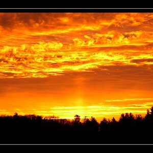
An area of pure black with no detail like the tail in this one and the model's hair in the others is going to suck your eye into it and it won't look so hot in a print because of the lack of detail. The blue is also an incredible eye draw in this one. It is intense, pure and heavy blue that borders on looking un-real because of it. I am wondering if you are seeing the same things we are? Or if your monitor is perhaps slightly lower on the contrast?
 
Ok. I see that. When I am WBing in Phototshop do I use both the purest white and the darkest black to set my balance?
 
Ok. I see that. When I am WBing in Phototshop do I use both the purest white and the darkest black to set my balance?

No, that isn't the best way to set WB, unless you are certain you have a total white spot (or an absolute medium gray) in your image to set to the White.
WB is correcting the temperature of the image.
That is typically and more easily done in the RAW converter but it can also be manipulated in PS by doing color balance or using photo filters.
 
Gotchya. If I do find a spot that is even close to white (RGB 250, 250, 250) is it ok to use to WB? And if it is ok, do I also need a black spot (0 0 0) to even out the WB? I believe it was HmH who earlier used a "close" area to show an example of where to WB.
 
If you are a newbie don't trouble yourself with raw yet. Listen to Christie Photo and use a grey card.

Mind if I ask why? Its just another file option, it just happens to contain more data. Actually, I'd almost say noobs need Raw more than pros because it gives more options even in basic post processing.
 
What you need is a spot that you think ( or know) is white.
Then, whatever they values are in the image, you can correct them to pure white.
That is the reason that people use grey cards or b/w/grey cards, so they can have those standards.

Link to Gretag MacBeth color checker with W & B squares


The thing is when you are looking for values to hit for your white balance while the WB is still off, you will have a hard time finding the one that is those values... You will have one of the colors stronger than the others or even two.
If you use a grey card and set white balance in camera you are setting it to the perfect measurement for that light you were working in. There is no guessing if it's truly neutral or not...

Your contrast and black level is way too strong and that's what is making those extreme colors and black spots with no detail. You don't want to lose all detail either in highlights or shadows if at all possible. If you must lose all detail you want to make sure it's not a huge spot that is going to suck you into the black hole or color that is going to look totally unreal or be over saturated in print... Which brings me to the next question: What color space are you working in? Are you perhaps editing in Lightroom?
 
Any time all 3 color channeks are equal R=200, G=200, B=200, or R=173, G=173, B=173 that is a neutral gray tone.

Pure white is 250, 250, 250 and is useles for setting WB. Pure black is 0, 0, 0 and is useles for setting WB .

18% gray is 217, 217, 217 and that is what you most want to use, which is why you place an 18% gray card into a shot so you know for certain you have a known value WB target to click the WB tool on.

Not all scenes will have an area of neutral gray.
 
Ok. So after doing some research and reading through the camera's manual (gasp...yes, I actually opened it) I have 3 possibilities as to what could be causing the increased contrast.

#1-I discovered that the Auto Lighting Optimizer was set to "strong." I now understand that this can increase the lighting and contrast automatically in my pictures. Could this be part of the problem?

#2-I am not a Photoshop pro and so adjusting the picture to the correct WB could be causing an increased contrast. I may even be correcting an all ready correct picture for all I know.

#3-In the larger version of the last picture of the squirrel, I can see some definition in his tail however, a shadow from the tree happens to fall across him/her right at the base of the tail and then when decreasing the size of the image to upload it to photobucket, it seems to also make the area darker.

I will post up the untouched picture when I get home to see if I am just overcompensating an already well done WB.
 
#1 could be some of it. You're shooting jpeg? Check your picture style menu and see what that contarst is set to also.
I really want to know what colorspace you are working in. Canon right? I think??
Second menu at the bottom will be your colorspace and the next up should be the picture styles or right about there.
I really think you may have a colorspace conflict somewhere too. The images you are posting are TAGGED as sRGB, but there is no colorspace embedded. Do they look the same on the internet as they do on your computer?
Are you editing in Photoshop CS or Elements? or Adobe Camera Raw?
 
#1 could be some of it. You're shooting jpeg? Check your picture style menu and see what that contarst is set to also.
I really want to know what colorspace you are working in. Canon right? I think??
Second menu at the bottom will be your colorspace and the next up should be the picture styles or right about there.
I really think you may have a colorspace conflict somewhere too. The images you are posting are TAGGED as sRGB, but there is no colorspace embedded. Do they look the same on the internet as they do on your computer?
Are you editing in Photoshop CS or Elements? or Adobe Camera Raw?

Yes, I am shooting jpeg? Seems to be the easiest for me to handle at the moment. My camera is a Canon T2i. And I use Photoshop CS5 the most. Have dabbled with Camera Raw, but not much.

I currently do not have my camera with me at work, but I can check the settings when I get home this evening. :)
 
You are fine to shoot jpeg.
When you get home check what colorspace your camera is set in.
Then in photoshop with no image open Edit>color settings
You ultimately want to be using sRGB for print and internet. Personally I choose to work only in sRGB. My theory is that if I cannot see it and I cannot print it and I cannot put it on the internet-why use it only to have it change when I convert.
In which case your settings in that dialog should read North American General Purpose 2 at the top and in the RGB box it should be sRGB IEC...
In the second set of boxes down there will be little check boxes. If you check them it will warn you any time you are working with something that is a colorspace other than sRGB and let you determine what to do with it.

If you are among the many that want to work in a larger colorspace then you need to CONVERT to sRGB before saving for print and web. Once you are done working in PS you'd then go to Edit>convert to profile... srgb...

When you hit save and the save dialog box comes up you should be showing an ICC of the sRGB and the second dialog there should be level 10, baseline standard for most labs. It could be less for internet viewing, I just don't change it at all cuz I don't see a need to.
 
Ok. Thanks. Straightening is an easy fix, but any suggestions on properly changing the skin tone?
I use the 77mm expodisc to set white balance at the time of the shoot, Usre you pre set WB in camera, you should have up to 6 pre sets. So you can do a days shoot in different lighting conditions, set once and forget. easy and fast.It is fast and saves a lot of time in a photo shop.
 

Create an account or login to comment

You must be a member in order to leave a comment

Create account

Create an account on our community. It's easy!

Log in

Already have an account? Log in here.

Back
Top Bottom