oldhippy
Been spending a lot of time on here!
- Joined
- Sep 16, 2012
- Messages
- 4,835
- Reaction score
- 6,555
- Location
- kentucky hills
- Can others edit my Photos
- Photos NOT OK to edit
Natural lighting, red cutting board at kitchen window. Full manual, hand held.
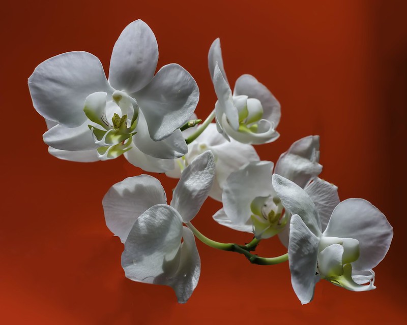 _DSC3179-Edit-Edit-Edit by ed brown, on Flickr
_DSC3179-Edit-Edit-Edit by ed brown, on Flickr


![[No title]](/data/xfmg/thumbnail/34/34132-7c7fbdcb2006703d33f975289561cd9d.jpg?1619736303)