What's new

Windows and Doors

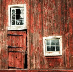
I like it. I'd darken the lower mid-tones to get some more richness and contrast in the wood/paint, but that may be just my preference.
 
Thanks Ken, care to show an example with a brief explanation
 
I like the image...especially the ill fitting door and broken windows. The comp is nice, all I think it needs is to be darker and richer...give it some mystery.
 
I did a quick and dirty processing using Snapseed on my iPad. A great photo to start with. Others who have greater skills with photoshop will be able to do so much more with it.
 

Attachments

  • $image-1022750187.webp
    $image-1022750187.webp
    251.7 KB · Views: 123
I don't know Semicolon, like Ken said, maybe it's a matter of taste, but I think you lost a lot of the fine weathered textures in the white around the windows. I do see what you have done. Mine looks rather flat compared to yours. This is really apparent in the blacks of the door hinges. I think, for my taste, the answer is in between the two.

 
Rick, all you do (assuming you're using PS) is to add a Curves adjustment layer and pull down the curve at somewhere between 50 and 100 (out of 255) and see if you like what you get. Semicolon appears to have also lightened the highlights, which I wouldn't do in this image.
 
Thanks Ken, I'm using Photo Pro 3. I'll play with it this weekend. Yeah, Semicolon's edit blew up my windows.
I do like the richness of the red siding, but for my taste it might be a knotch above natural looking.
Thanks again to both of you.
 
I like the image...especially the ill fitting door and broken windows. The comp is nice, all I think it needs is to be darker and richer...give it some mystery.
I agree with this.

Nice work, Rick – right up my alley.
 
I really like the composition. Texture is great. I do think the clarity and texture needs increased a bit.

Thoughts?

View attachment 23451
You nailed it. Very nice work!
Now I need to see if I can figure out how you did it starting with Ken's tip.
 
I really like the composition. Texture is great. I do think the clarity and texture needs increased a bit.

Thoughts?
You nailed it. Very nice work!
Now I need to see if I can figure out how you did it starting with Ken's tip.

I opened the original in ACR, set the white and black points, increased the clarity quite a bit to about 60 and vibrance about 25.
Then sharpened it just a little.

Clarity always works nicely with textures.
 
I've been a film man for many years and all this digital terminology is new to me. Setting white and black point is a perfect example. Ive heard it used many times. Time to hit the books!
 

Create an account or login to comment

You must be a member in order to leave a comment

Create account

Create an account on our community. It's easy!

Log in

Already have an account? Log in here.

Back
Top Bottom