What's new

Windows and Doors

Rick58 said:
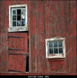
I don't know Semicolon, like Ken said, maybe it's a matter of taste, but I think you lost a lot of the fine weathered textures in the white around the windows. I do see what you have done. Mine looks rather flat compared to yours. This is really apparent in the blacks of the door hinges. I think, for my taste, the answer is in between the two.

Like I said, quick and dirty on an iPad. The photoshopped ones look much better. I like them more. But it all starts with a good shot.
 
Rick58 said:
I don't know Semicolon, like Ken said, maybe it's a matter of taste, but I think you lost a lot of the fine weathered textures in the white around the windows. I do see what you have done. Mine looks rather flat compared to yours. This is really apparent in the blacks of the door hinges. I think, for my taste, the answer is in between the two.

Like I said, quick and dirty on an iPad. The photoshopped ones look much better. I like them more. But it all starts with a good shot.
Thanks Fred. Your "quick and dirty" made me see just how flat my original was.
 
Here's my take. I pulled down the curve a little around 65 or so and flattened the highlights a bit: (1) lowered the curve from 255 at the top end to 253 and raised it at about 220 to correct for the slight darkening from pulling the curve down at 65. While I was at it, I darkened some around the edges using a brightness adj layer (about -9 I think) and painting white around the edges of a black mask (this is my preferred method for selective adjustments, other people have other ways).
 

Attachments

  • $Rick58a.webp
    $Rick58a.webp
    73.6 KB · Views: 87
Rick, where was this yummy place?
And where are you going shooting today...;)
 
View attachment 23547

Rick Left, Ken Right.

The biggest difference I see is in the whites. You maintained much more detail in your highlights
You wood is also slightly lighter and more as I remember it. Nice job Ken :thumbup:

Oh yeah, sorry Mishele, the barn is on Daniel Boone Rd, just off past the Daniel Boone Homestead entrance
 
Here's my take. I pulled down the curve a little around 65 or so and flattened the highlights a bit: (1) lowered the curve from 255 at the top end to 253 and raised it at about 220 to correct for the slight darkening from pulling the curve down at 65. While I was at it, I darkened some around the edges using a brightness adj layer (about -9 I think) and painting white around the edges of a black mask (this is my preferred method for selective adjustments, other people have other ways).

Thanks for that Ken. I learn from doing, so I'm going to take your notes and see how the different corrections affect the image. Then I'm going back to the fresh raw image and rebuild from scratch. practice...practice...practice :wink:

It seems I'm having trouble holding back the highlights. I'm sure this will become clear while tracing your notes.

Whatever happened to paddles and masks for dodging and burning or tilting the easel for PC. Simple times :(
 
Rick58 said:
Thanks for that Ken. I learn from doing, so I'm going to take your notes and see how the different corrections affect the image. Then I'm going back to the fresh raw image and rebuild from scratch. practice...practice...practice :wink:

It seems I'm having trouble holding back the highlights. I'm sure this will become clear while tracing your notes.

Whatever happened to paddles and masks for dodging and burning or tilting the easel for PC. Simple times :(

If you are working in ACR "holding back the highlights" should be easy. Just pull the highlight slider to the left.
I do 95% of my post in ACR because it is so quick and easy.
If you are into online, video type learning, I would highly recommend getting a one month subscription to kelbytraining.com. There are several amazing, step by step training videos that will help you understand RAW processing in no time.
 
I like it. I like the original the best.

The crop felt a LITTLE tight.

Remember, you'll never please everyone. Sometimes you need to go with your gut.
 
Whatever happened to paddles and masks for dodging and burning or tilting the easel for PC. Simple times :(

Yeah, I know I found it amusing that the things you mention were faster in the darkroom than in PS. On the other hand, PS does really well with complex dodging and burning that would be extremely difficult if not impossible in the darkroom. The actual dodging and burning tools are rarely the best way to do this. Some sort of selective brightness adjustment is easier to control and more adjustable later if you change your mind.

As for the highlights, this is a difficult scene to meter because the highlights are such a small part of it, and the metering system will tend to overexpose them. I always check a scene with highlights on the camera screen and look for the blinking overexposure indicator. A raw processor will allow some degree of recovery, but it's always better to avoid that by just re-shooting.
 
That is a fine image; i liked semicolon's edit (i like saturation ;) )

Thanks Frequency, Besides the blown whites in semicolon's photo I felt it was OVER processed for my taste. Don't be mistaken. I very much appreciate his assistance and it did open my eye to how flat my version was. But I have both feet on the ground. I want my pictures to represent what I saw when I took them. As a stand alone image, semicolon's version would be great, but the textures are too radical to represent what I saw that day on the barn. The entire barn showing the windows and door can be seen in my gallery. The versions Ken and I made are even teetering on the edge of my reality as the actual textures were semi subtle. But bringing out the textures does make a more interesting photo. I guess it's robbing Peter to pay Paul.
 
Hey Rick.

Something to think about...

1. Try to have your pictures represent what you saw and FELT when you took them.
2. Don't let the processing do the talking, let the composition do the talking. (I don't think you are... yet... but some things you say lead me to believe that you're about to start slipping into that world of "I must HDR and overprocess everything". It's a common pitfall for a lot of new photographers and I'd love to see you miss it.) :)
 
I like it. I like the original the best.

The crop felt a LITTLE tight.

Remember, you'll never please everyone. Sometimes you need to go with your gut.

Actually, the original is closest to reality. At least in my mind. Hey, BTW, you never commented on the cute girl friend I sent you :wink:
 
Hey Rick.

Something to think about...

1. Try to have your pictures represent what you saw and FELT when you took them.
2. Don't let the processing do the talking, let the composition do the talking. (I don't think you are... yet... but some things you say lead me to believe that you're about to start slipping into that world of "I must HDR and overprocess everything". It's a common pitfall for a lot of new photographers and I'd love to see you miss it.) :)

I may be old school, but to me HDR is entertaining and CAN BE nice to look at. But to me it's more like looking at a painting as opposed to a photograph. Shortly after I joined there was a HDR of a mine car at an amusement park. I like "back woods railroading" and turn of the century mining, so it was entertaining for me to view, but it wasn't a "photograph" in my mind.
 
I like it. I like the original the best.

The crop felt a LITTLE tight.

Remember, you'll never please everyone. Sometimes you need to go with your gut.

Actually, the original is closest to reality. At least in my mind. Hey, BTW, you never commented on the cute girl friend I sent you :wink:

Keep in mind that reality doesn't necessarily carry an image. Sometimes you do need to tweak things a bit.

What girl? What did I miss??!?!? :lol:

Hey Rick.

Something to think about...

1. Try to have your pictures represent what you saw and FELT when you took them.
2. Don't let the processing do the talking, let the composition do the talking. (I don't think you are... yet... but some things you say lead me to believe that you're about to start slipping into that world of "I must HDR and overprocess everything". It's a common pitfall for a lot of new photographers and I'd love to see you miss it.) :)

I may be old school, but to me HDR is entertaining and CAN BE nice to look at. But to me it's more like looking at a painting as opposed to a photograph. Shortly after I joined there was a HDR of a mine car at an amusement park. I like "back woods railroading" and turn of the century mining, so it was entertaining for me to view, but it wasn't a "photograph" in my mind.

:)
 

Create an account or login to comment

You must be a member in order to leave a comment

Create account

Create an account on our community. It's easy!

Log in

Already have an account? Log in here.

Back
Top Bottom