karimmaalouf
TPF Noob!
- Joined
- Apr 18, 2012
- Messages
- 13
- Reaction score
- 0
- Location
- Lebanon
- Can others edit my Photos
- Photos NOT OK to edit
Hi
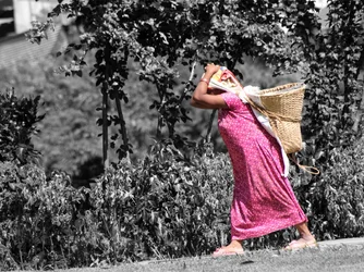
what do you think of this picture? and why?
i am submitting this picture to a local photo contest themed: farmer pictures.
this is a picture of a Nepali farmer carrying on her forehead mud and gravel to build her house...
do you think it has any chance of winning?
thanks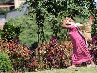
what do you think of this picture? and why?
i am submitting this picture to a local photo contest themed: farmer pictures.
this is a picture of a Nepali farmer carrying on her forehead mud and gravel to build her house...
do you think it has any chance of winning?
thanks


 ......just joking...



![[No title]](/data/xfmg/thumbnail/32/32182-3ec35e12e238c681a086455c4586fbef.jpg?1734161047)
![[No title]](/data/xfmg/thumbnail/42/42056-76026251cb5ebb85b4a4d281d36121d8.jpg?1734176440)
![[No title]](/data/xfmg/thumbnail/32/32631-60d0db057ee085953a0921e337396654.jpg?1734162116)
![[No title]](/data/xfmg/thumbnail/42/42055-105f2ee23a1fd79c786de42c5578274b.jpg?1734176440)