What's new

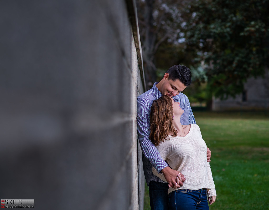
Zach & Erin | Second Engagement Shoot | Harkness Park

D-B-J

Been spending a lot of time on here!
Joined
Apr 13, 2010
Messages
9,027
Reaction score
2,175
Can others edit my Photos
Photos OK to edit
Tonight I had my second engagement shoot, again at Harkness Park. I can tell that as a photographer I'm getting much more comfortable while shooting. I'm becoming better at posing, at lighting, and becoming more creative in my shoots. But I've also learned that I could never do this as a full time job. I charge x amount and assume it'll take an hour or so, and tonight I ended up shooting for almost two. I get so caught up in shooting that I'd rather spend more time making images the clients and I love than having to worry about my final profit. None the less, I love photography and am really enjoying it. Comments and critiques are ALWAYS welcome. I still have MUCH to learn :)

Rest Easy by f_one_eight, on Flickr

Zach and Erin by f_one_eight, on Flickr


Cheers!
Jake
 
Last edited:
I would say NOT BAD, not great.

1. I guess the things I don't like is her facial expression and her skin looks a little cold / blue.

2. Too much wall in my opinion.

The image quality on these are really good and I think you most likely have better ones from this shoot.
 
I would say NOT BAD, not great.

1. I guess the things I don't like is her facial expression and her skin looks a little cold / blue.

2. Too much wall in my opinion.

The image quality on these are really good and I think you most likely have better ones from this shoot.


Yeah I have plenty more, these are just my first two edits. Thanks for your input! Personally, less wall would make the image not weighted correctly, as it'd end up right-side heavy. And the blue? That's my images. They always have a blue tint--I guess it's my post-processing style.

Cheers!
Jake
 
Bump
 
Completely missed this.

Not sure how thats possible? hahaha

Anywho, In these two you posted, I think your ambient to strobe ratio is a bit off for this shoot and maybe my taste for this specific shoot.

I feel it should be a lot warmer and brighter, and it seems kind of cool and dark.

Needs a lot of warmth and love.

And in the first one, it feels like she's really tiny compared to her partner, almost like a little kid hanging onto daddy's arm. I would try to bring his face into the shot and have him rest his head against hers, maybe kiss her forehead or whisper in her ear....or something to bring more 'life' to the photo.

Minus a little speckle up top, there is no skin from him, so its almost like he doesn't exist.


I like the pose and composition in number 2, by looking at this, I can tell he towers over her. But see how he leaned down to look into her eyes, it brings a connection, I think the connection was a little lost in 1.


These are very good though, nice job.
 
Completely missed this.

Not sure how thats possible? hahaha

Anywho, In these two you posted, I think your ambient to strobe ratio is a bit off for this shoot and maybe my taste for this specific shoot.

I feel it should be a lot warmer and brighter, and it seems kind of cool and dark.

Needs a lot of warmth and love.

And in the first one, it feels like she's really tiny compared to her partner, almost like a little kid hanging onto daddy's arm. I would try to bring his face into the shot and have him rest his head against hers, maybe kiss her forehead or whisper in her ear....or something to bring more 'life' to the photo.

Minus a little speckle up top, there is no skin from him, so its almost like he doesn't exist.


I like the pose and composition in number 2, by looking at this, I can tell he towers over her. But see how he leaned down to look into her eyes, it brings a connection, I think the connection was a little lost in 1.


These are very good though, nice job.

Yeah he was significantly taller than here. Maybe even a full foot? And I definitely still have a lot to learn about posing and composition on engagement shoots. I think the flash to ambient is my "style" I guess, but I can see how this might be heavy handed and a bit too moody. I'll keep at it. Thanks for the detailed response Sean.

Cheers!
Jake
 
I really like #2 there's not too much wall its perfect, the blue tint and processing has a really nice editorial look :)
 
I really like #2 there's not too much wall its perfect, the blue tint and processing has a really nice editorial look :)

Thank you very much!
 

Create an account or login to comment

You must be a member in order to leave a comment

Create account

Create an account on our community. It's easy!

Log in

Already have an account? Log in here.

Back
Top Bottom