Tittan
TPF Noob!
- Joined
- Jan 11, 2011
- Messages
- 38
- Reaction score
- 17
- Location
- Trondheim, Norway
- Website
- www.kittelsaa.com
- Can others edit my Photos
- Photos NOT OK to edit
Follow along with the video below to see how to install our site as a web app on your home screen.

Note: This feature currently requires accessing the site using the built-in Safari browser.
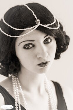
like 4-1? thoughts?She's styled quite nicely and had a nice look herself. Lighting should be much higher ratio if you want the image itself to look retro.
What film does it take ?I've got an old camera, but it's quite difficult to find film for it, so I'm stuck with digital for now.
The light is not quite there, I agree. I added a diffusor to the window, but I see now that it wasn't enough. I'm guessing the problem was the sun popping in and out from behind the clouds. It's my first ambient light shoot in months due to living so far up north. All in all, I don't think it's bad, but there's stuff I need to work with before my next try. Thank you all for your input, it's valuable!
Tittan said:I asked the model about it just now, and she told me it's most likely a hair from her dog. Kicking myself for not seeing that during the shoot.
I'm gonna be brave enough to admit to being a dunce here ... What exactly do you mean by the ratio? Shadow area to highlight, as in highlight should be 4x brighter (2 stops?) than shadow region?like 4-1? thoughts?She's styled quite nicely and had a nice look herself. Lighting should be much higher ratio if you want the image itself to look retro.

![[No title]](/data/xfmg/thumbnail/37/37604-7ad625e983f92f880eb65a264eeef5e4.jpg?1619738148)