iamthepip
TPF Noob!
- Joined
- Apr 2, 2010
- Messages
- 41
- Reaction score
- 0
- Location
- West Coast
- Can others edit my Photos
- Photos OK to edit
Please Tell me what i can work on. i am very open to criticisms!
like i said in the post title my camera is a Canon rebel T2i i am using the standard 17-55mm lense. iso-automatic
take a look at my work tell me what you think, what should i work on? what should i work on? how can i be a better photographer.
Thanks
-Pip
Flikr.com/iamthepip
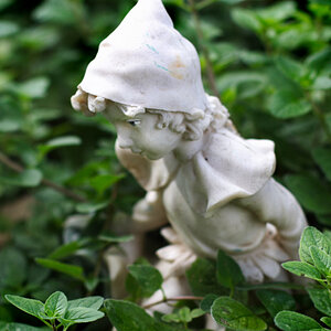
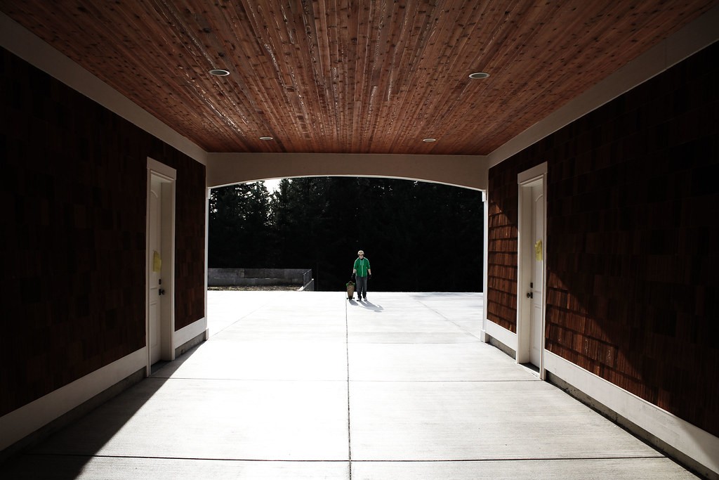
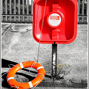
1)
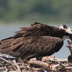
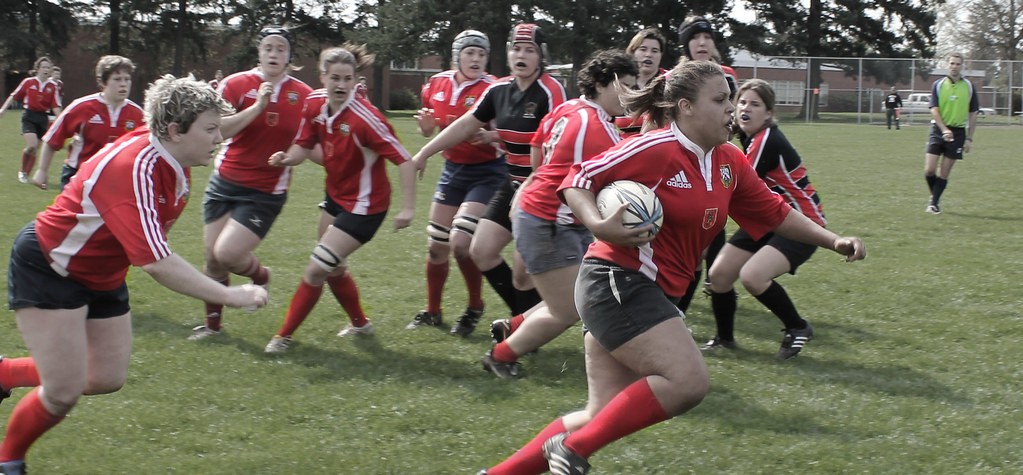
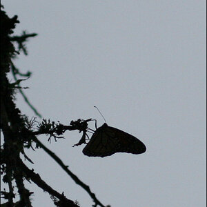
2)
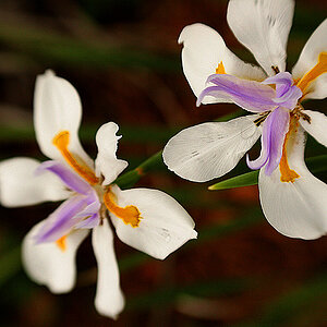
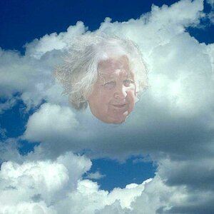
3)

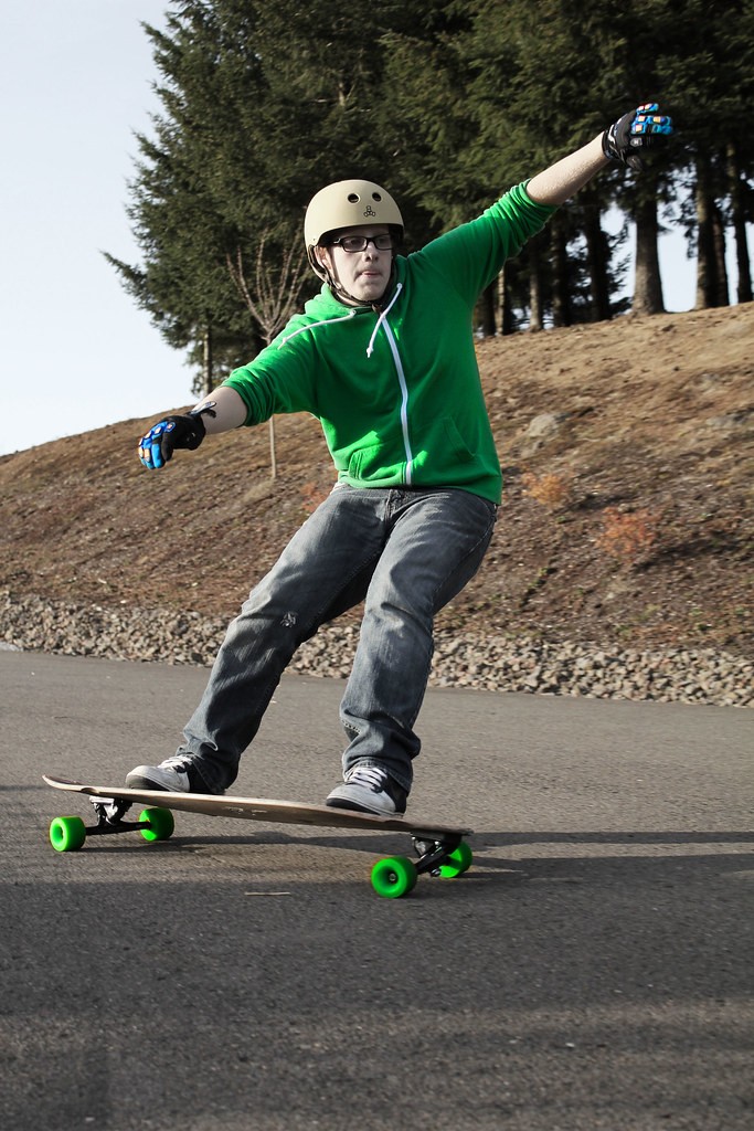
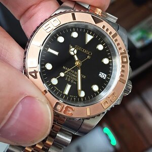
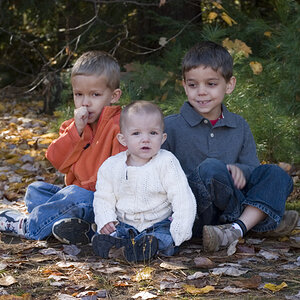
4)
like i said in the post title my camera is a Canon rebel T2i i am using the standard 17-55mm lense. iso-automatic
take a look at my work tell me what you think, what should i work on? what should i work on? how can i be a better photographer.
Thanks
-Pip
Flikr.com/iamthepip
1)
2)
3)
4)
Last edited:
 longer shutter speed ill try next time thank you
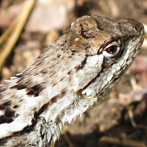


![[No title]](/data/xfmg/thumbnail/39/39292-4169a355b794ae9735845c4ad45d06ff.jpg?1619738958)