Need C&C

Bgagnon127

TPF Noob!
Joined
Apr 17, 2011
Messages
269
Reaction score
7
Location
Rhode Island
Website
www.briangagnonphotography.com
Can others edit my Photos
Photos OK to edit
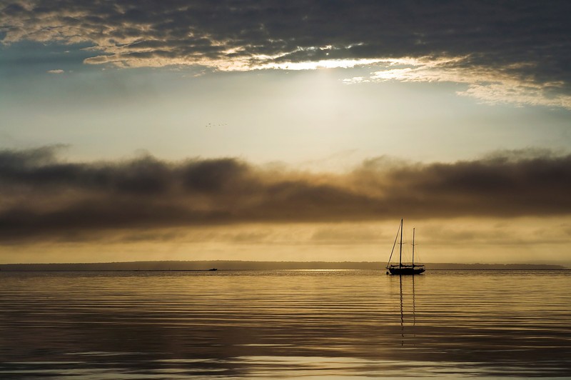
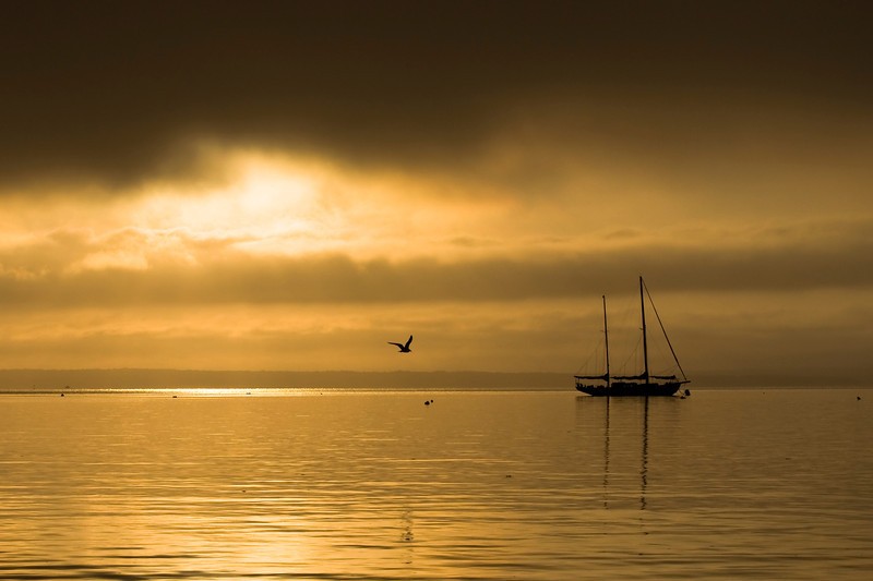
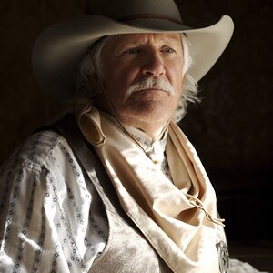
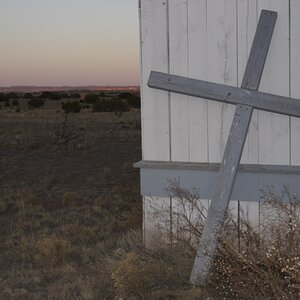
i shot these this morning and I need some different points of view. these are my favorite out of the shoot but i can't narrow down which one is the strongest. Any opinions are appreciated.
DSC0331-L.jpg

DSC0328-Edit-L.jpg

DSC0255-L.jpg

DSC0343-L.jpg
 
I like the first and third the best, and I'm not a fan of #4 at all. The only thing I don't like about #1 is the spot in the lower left, so I guess that makes #3 my favorite. :)
 
First three are all awesome; third is the best in composition and colors; the last compromises on the feeling of vastness felt in the first three due to the inclusion of shore and tree
 
Frequency said:
First three are all awesome; third is the best in composition and colors; the last compromises on the feeling of vastness felt in the first three due to the inclusion of shore and tree

Thanks frequency, I appreciate the comments.
 
I keep going back to the 2nd one. I agree with Frequency in regard to the last shot. Nice Job!
 
I really like #2 and #3. But I think #3 is better because the boat is closer :)
 
I kept looking at your shots and something kept bugging me but I couldn't put my finger on what it was until now. Most of the space is in the back of the boat except for #2 and that does the same to me as portraits with more space at the back of the head rather than in the looking direction. If it doesn't bother anyone else, I guess I am just showing how weird I am, lol.

Other than that, I agree that the white light in the lower left of #1 one is annoying but, even more so is the fact that I feel it was shot through something. I'm seeing lines running up and down and tones that don't seem to fit. And in #4, I would have moved the picnic table or cloned it out.

The light in #2 is my favorite.
Interesting, I see what you're saying about the boat looking like it's exiting the scene rather than entering. Not exactly sure what you mean about shot #1 looking like it was shot through something. They're not edited very much except for duplicating background layer and applying a blending mode to add contrast and more saturated color. Based on all the feedback I agree that 2&3 are the strongest. Thanks for the comment
 

Most reactions

Back
Top