Possibly Searching For a Niche

Rick58

Been spending a lot of time on here!
Joined
Jun 23, 2012
Messages
4,227
Reaction score
1,473
Location
Reading, Pa
Can others edit my Photos
Photos OK to edit
Out of all the photo's I've taken this year, only two really stir any feeling in me. If I were to actually print any, I would fine tune these, do a retake with my 4x5 and this would be my sum for 2014
A Balanced Society
ABalancedSociety_zpsda85dc4e.jpg

...and, Life after Death
LifeafterDeath_zps60037943.jpg


These certainly are not my "best" or "prettiest" shots of the year, and yet to me, they are the only to that evoke any emotion. I've been going back to these since I took them early this spring and still can't put my finger on "why". What is it that I'm missing in myself and can't put my finger on?
 
Last edited:
For me at least both are excellent examples of juxtaposition and contrast. Together they tell a 'story' (I hate that phrase). Good work I think.
 
Thanks Monte,
Your post was helpful in two ways, after hearing the term for years, it forced me to look up "Juxtaposition", and it also reminded me how much I, like you, hate the term "Tell a story" :048:. Thanks again for your input
 
What is it that I'm missing in myself and can't put my finger on?

I'm not sure what you're looking for, so that makes us even. (lol)

Just going to take a wild stab at it here:

The first shot has repetitive elements, contrasting textures, the slope of the hill gives you strong diagonals, and of course the dichotomy of houses and headstones. It's a pretty good shot, but is cluttered with extra elements competing for attention.

The second shot has the strong solid geometry of the monuments juxtaposed with mostly just texture of a city in the background. It has a good range of tone, some leading lines, and the symbology of the Cross rising above the tallest building.

I think printed up and displayed together these would bolster, if maybe not actually define, a theme.

If you go back to revisit these scenes, try to capture better light and sky, as the current light is fairly flat.
 
These very definitely have a 'film' feel. I like that, good job in processing and in initial exposure ... tons of zones. I wouldn't do anything to the latter image, I don't see how any reshoot would improve the image unless you went for a time of day effect. Early morning lighting, hazy, less contrast, overcast, less shadows (if any of those occur in your mornings), or late afternoon, evening lighting, more directional, longer shadows type of thing. These images certainly convey an absence of life. They remind me of that old Gregory Peck, Ava Gardner movie, 'On the Beach'.

The first image, to me, I think can be improved. The first thing I see are the tightly packed homes, then the tombstones, but it takes me a bit to get my eyes down there. Then another bit to recognize them as tombstones due to the lack of writing (backs). After a bit I can accept the tombstones and homes combo and even the wide one-third striation works, but I do find the cars very distracting. In my cheese-cream brain, they don't seem to fit ... I want them out. Soooo ... I reshoot this at a time when the cars are gone.

I like them both, I just hate the cars in the first image. Thanks for sharing.

Gary

PS- There appears to be a very slight dodging halo around the cross.
G
 
i like them because they have a real quality to them. There are photos made to be pretty... and then there are photos. That said I prefer the second one and the lead down and overlook. The first as mentioned has the roof line and tilt which I like, but kind of leaves me a little less enjoyed from the cars down. two cents
 
Thanks guys for the input. These were both posted previously and went through the Critque grinding mill. Funny, the first time the cars were also mentioned. Unfortunately, theres ALWAYS cars there.
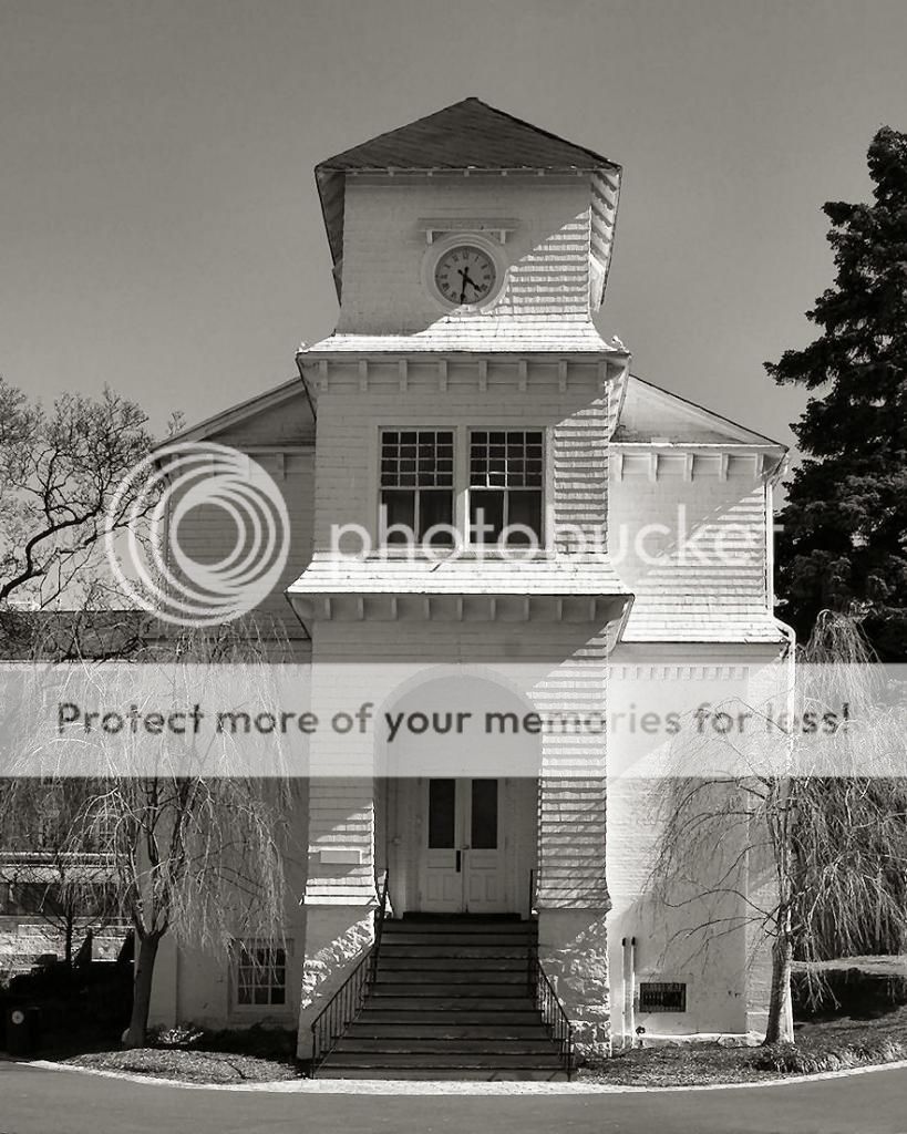
Anyway, I put this in the discussion area to discuss "style" more then critque. I've aways been a fan of Walker Evans, and in this shot someone picked up on the resemblance during critque.
WhiteChapel_zpsfdbdf15f.jpg

Do you think a photographer subconsciously mimic's a style or is he simply attracted due to his own style?
 
Last edited:
For me both. When I see a photo which I think is successful, I try to catalog and remember the image for later reference. When in a similar situation or a situation which may benefit from whatever element(s) I found interesting, I can recall, emulate and/or adapt to my situation and image. Sometimes I think about the various possibilities gleaned from other images and sometimes it's just a reaction a very fleeting thought. There is nothing new under the Sun.
 
Out of all the photo's I've taken this year, only two really stir any feeling in me. If I were to actually print any, I would fine tune these, do a retake with my 4x5 and this would be my sum for 2014
A Balanced Society
ABalancedSociety_zpsda85dc4e.jpg

...and, Life after Death
LifeafterDeath_zps60037943.jpg


These certainly are not my "best" or "prettiest" shots of the year, and yet to me, they are the only to that evoke any emotion. I've been going back to these since I took them early this spring and still can't put my finger on "why". What is it that I'm missing in myself and can't put my finger on?


Like #1 best. Good work!

Get out more and maybe more pix next year.
 
We humans learn (mostly) by copying what others have already done. That is known as education. If you're a team-sport athlete, you look at the videos to see what the most successful players are doing right. If you're an engineer, you are expected and required to follow the rules that have already been worked out. If you're a medical professional, you're expected to follow a protocol (rules that have been worked out as being effective). If you're an artist, you learn, initially at least, by copying what the masters have done. So if you are reflecting a style you have admired in a photographer, that's not a sin - that's a sign you're paying attention.

Now, once you've got the foundation in place, then there's your departure point for your own addition to the canon (and I'm not referencing the camera manufacturer).

Your first image is interesting because you have repetition, diagonals, tone, and juxtaposition. In an "ideal" world, the wires, cars and fence would disappear, but then this is an image of the real world. Actually, the cars work for me, as they give the clear indication that this is a "real" shot, and they also tend to date the image to a specific time period. If I can offer a suggestion, it would be to shoot a bit lower, so that the tombstones partly obscure the dividing line (the diagonal) and make the stronger connection between the rear vertical elements (the townhouses), and the foreground elements (the tombstones).

I do love your second image, and the way you framed the dark monument to be higher than any of the other man-made features (smokestack, skyscraper at the right). The tones are just delicious. The massiveness of the black stone compared to the lightness (both in tone and in size) of the background, seems to state pretty unequivocally what our fate will be. And yet, it is not a morbid or depressing image, for the stone actually takes up only a (small) part of the image.

As for the link between your third image and Walter Evans, I see it. He shot many of his building shots in a flat-on manner, almost deliberately removing the depth element. You've done some of that by shooting it face on, and letting the light and texture give the church its form. If anything, you could have included more of the street in front of the church to truly reflect Evan's approach to buildings (you'll note he usually showed a lot of the empty street in front of the buildings he shot).

Rick, you have an eye. Your images may not be arty-farty, but they come across as real, honest, (without artifice), and clean.
 
Paul, Thank you for the time and effort put into the lenghty reply and compliments. I dabbled in still lifes last winter, some of which turned out quite nice, but it was forced and unnature. Color is almost just a novelty to me. Maybe 1 out of 10 photos leave processing as a color photograph, the remainder are converted to B&W in my mind before the shutter is even pressed. I think I may have been born 50 years too late.

Regarding the first photo. I see your lower angle suggestion. I would also like to line up the 4 stones with the 4 houses, but this will cause me to shift to the right, and I'm not sure how that angle will work. Regardless, another attempt is in order.
 
Last edited:
They both have strong compositions as well as a real feeling of depth, i.e., different layers, and as Designer pointed out the repeating elements add to the strength of the images. Actually, these images made me think of photographs by Walker Evans. I don't know if they resemble specific images of his or if the style is just similar. The church you posted later also makes me think of him because he took many like this, mostly in the South.

The first two were taken in cemeteries with the camera pointed outward. This is interesting because when I shoot in a cemetery I usually don't include surroundings. I have no idea what, if anything, this might mean, but possibly something to think about.
 
Like number 2. The blackened cross, while across town the white structure with the cross like antenna
 

Most reactions

New Topics

Back
Top