Roger

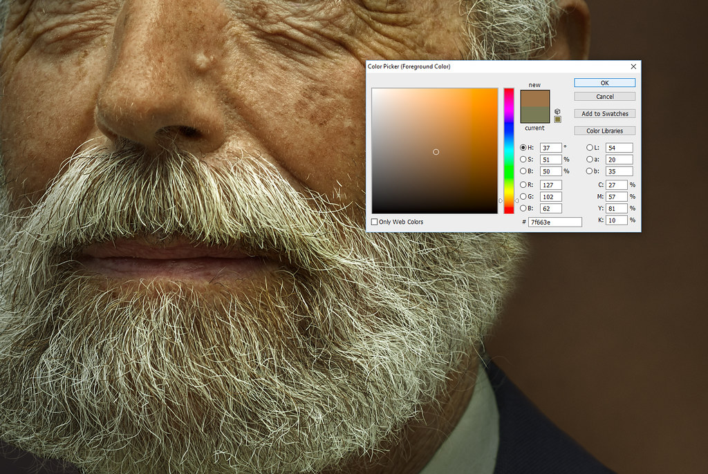
I've seen a Rembrandt or two before. They aren't green, and the eyes don't look like someone pushed the shadow slider to 1,000 -- many have eyes almost completely black.

8d5f5186497a800ffde9a679929f9999--rembrandt-paintings-art-paintings.jpg


there is an ongoing trend to push eyes to unrealistic levels, which looks fake and unnatural -- since of course, its faked and unnatural.
 
I must need to calibrate my monitor because I see nothing you are saying in his photo. Thanks for alerting me to that.
 
I mean, sample his shirt. the RGB values are around 63,77,54

upload_2017-8-4_11-36-3.png


even the beard:

upload_2017-8-4_11-36-41.png


the iris on the far eye is brighter than the near, but it my mind wants to see it slightly darker. It doesn't read as natural -- plus I know the effects of editing the eyes too far.
 
For me, the main focal point is the subject's face. I believe the OP has intentionally used lighting techniques to draw our eye to the man's face. The color of the clothing does not detract at all for me. The lighting sets a very specific mood and if this particular photo was done with an Apple app, I would like the outcome no less. Diversity is good.
 
..example of a classical,..has stripped away common ideals ..
Two opposing concepts.

What are you trying to say?

O.K., I get that you like it, but can you say why you like it? What are its redeeming qualities?
 
..example of a classical,..has stripped away common ideals ..
Two opposing concepts.

What are you trying to say?

O.K., I get that you like it, but can you say why you like it? What are its redeeming qualities?

I said it. He had a Renaissance inspired vision for the portrait. Tonal value, clarity, composition to name a few.
 
I said it. He had a Renaissance inspired vision for the portrait. Tonal value, clarity, composition to name a few.
O.K., then why did you write this: "He has stripped away common ideals of what portrait Photography has become." ?
 
I said it. He had a Renaissance inspired vision for the portrait. Tonal value, clarity, composition to name a few.
O.K., then why did you write this: "He has stripped away common ideals of what portrait Photography has become." ?
Many of the current , established, portrait photographers are not presenting in a classical, Renaissance style. I appreciate the style, and find it interesting that an artist would assimilate this in 2017 through photography. I don't know anything about post processing but I would assume he is working in multiple layers. If I were to recreate this photograph through painting, I would start with a yellow oxide ground coat and apply multiple layers of oil to build tonal value, using a simple pallet of earth tone color and a small amounts of complimentary color.
 
Last edited:
Nice to see that once again my image is stimulating debate - always good :)

@Braineack - I'm not trying to recreate a rembrandt so the link to the rembrabdt image is irrelevant. I also deliberately colour tone my images, which also makes white balance irrelevant. I recreated your little demonstration with the principal element of the image - the face. As you can see, the tones are orange/brown which is exactly what i was trying to achieve. So, no green colour cast.

Given that I have deliberately toned the image to achieve my desired aesthetic outcome, what difference does it make if that tone is green, blue or pink? I appreciate that you may not like the colour tone, an opinion you're entitled to, but ultimately that is irrelevant, as the image wasn't created to your aesthetic taste but mine. :)

36327564716_1afc88e125_b.jpg
 
Now that the " gentlemanly " discussion has slowed, I wanted to inform you that I nominated this photo for Photo of the Month here Photo of the Month - August 2017 Nominations.

I appreciate your effort and honestly would rather fill an empty space on a wall with something that pleases my taste than something sterile and " perfect " that does nothing for me.
 
I've found that most of the really good artists on TPF have developed a predominant "style", be it tone, lighting, pose, familiarity whatever. I'm thankful that folks like @Black_Square put their work up for review, as the knowledge the neophytes like myself can gain is huge.
 

None of those are green, nor have eyes that are borderline glowing.


also notice how you guys can't handle the simplest of criticism? full of dismissive & arrogant replies.

I never said I didn't like the photo. I said three things:

1. the hue is very green.
2. the framing is a little off.
3. the post-processing on the eyes reads unnatural to me.

Point out one place where i said anything negative about the style/atheistic, or I didn't like the photo. That has nothing to do with anything. My monitor calibration also isn't a problem, so that point is irrelevant.
 
Last edited:
me giving wanking gesture with my hand.
Well, that gesture, plus the fact you have expanded on it here, seems dismissive all by itself.

Of course, you are welcome and encouraged to offer critique, and the OP has acknowledged it in kind. It doesn't mean that the image is going to be tweaked to match it, and it doesn't mean that the other comments have no merit, either.

I'm looking at the image on my phone and can't see the green cast you're talking about, either - so it may in fact have more to do with your end. We all know that viewing images online is only as good as our monitors make it. Building an argument around color cast is risky in that regard.

Let's keep the comments solely on the image, and dispense with inflammatory posts, please.

Carry on!
 

Most reactions

New Topics

Back
Top