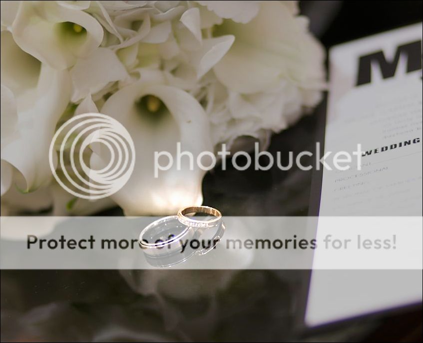
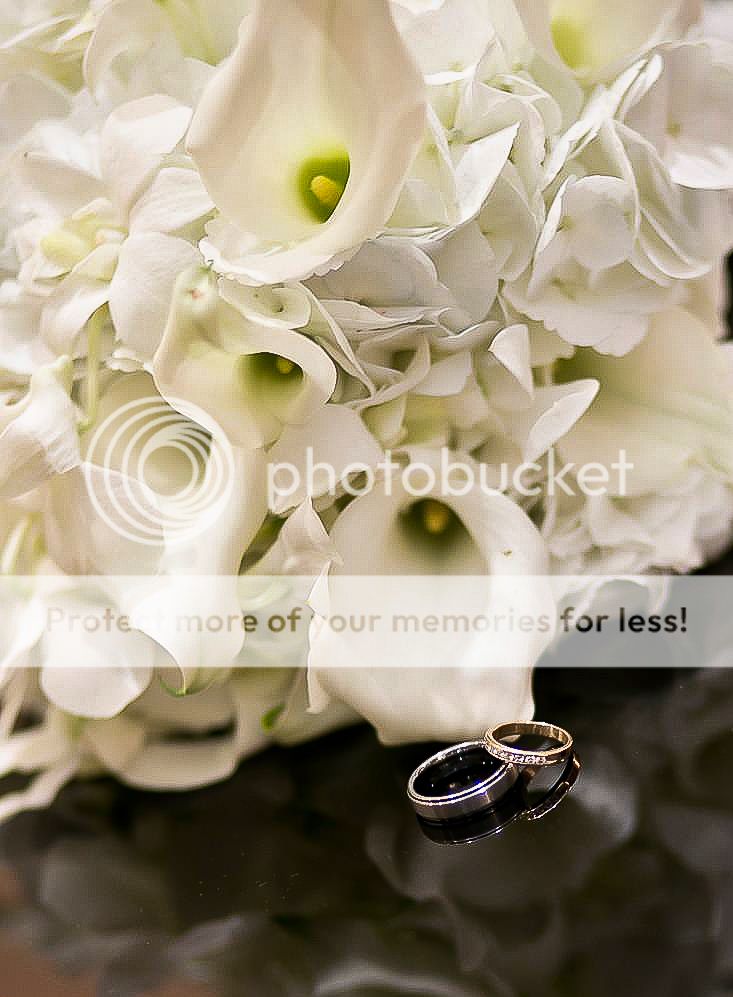
What I like:
-the reflection of the rings on the table
-the flowers
-the arrangement of the rings
What I don't like:
-the rings seem too small, and therefore it's hard to tell they are the focus of the image
-the rings get lost in the business of the flowers, they have too much detail which draws my eye there instead of the ring
-the white card on the right keeps drawing my eye, as well
What I would do differently:
-closer in on the rings, especially with the great reflection underneath them
-removing the white card all together
-putting the flowers farther behind the rings and use them for nice bokeh
-also shoot it on a lower angle
-a different crop as well, perhaps horizontal or square?
Those are just my thoughts, and as such, are always subject to being wrong!
I would have oriented the camera in a horizontal mode, and thus eliminated some of the out of focus foreground at the bottom, and also included more of the card's text. Also, I probably would have stopped the lens down two f/stops, for a bit deeper DOF band. Detail shots like this have become a really big deal for some people. Yours is nice to have, but it has some distracting balance in it. That corner of the table points right OUT of the frame, and has some kind of weird, copper-toned reflection in one corner of the table, but not the other.
As a study in visual weight based on image element size and brightness, the rings come in at #3 or #4 in the scene.
From a composition perspective, the center of a rectangular image frame is a weak spot.
The RoT 4 power points are very effective for drawing attention to an image element. almost as effective is putting an image element on on of the 2 RoT horizontal or vertical lines.
What I like:
-the reflection of the rings on the table
-the flowers
-the arrangement of the rings
What I don't like:
-the rings seem too small, and therefore it's hard to tell they are the focus of the image
-the rings get lost in the business of the flowers, they have too much detail which draws my eye there instead of the ring
OK, without the whole "Wedding" thing. . .I mean, it's 2 rings and some flowers, WTH else could be going on? It isn't really rocket science to see that 2 folks have decided to divorce in 12 years, oh wait, that's just my bad. . .


![[No title]](/data/xfmg/thumbnail/42/42065-b846d670a79653fe9a60fc2ba4bc683f.jpg?1619739998)
![[No title]](/data/xfmg/thumbnail/36/36664-a1f71b488f6761523649a87f8465fc3d.jpg?1619737676)

![[No title]](/data/xfmg/thumbnail/40/40308-f92e28f094216c151f3ad1fd7453c99b.jpg?1619739413)
![[No title]](/data/xfmg/thumbnail/42/42269-bc38cb35884d46241dcf3623b338b43b.jpg?1619740078)