Working Self "Portrait" C&C

Thanks for the input!
See, no matter how much you, as the artist, love something...I'll try this again and get detail on the fingers. After sleeping on it, I have to agree. :thumbup:

I still second guess myself all the time. My problem is the questions that I am asking myself... "What can I do to fix or make it better?" instead of, "What process, setting or composition will I use next time to make it better?
 
I like them both, Bitter.

And Ron, changing a tire? Really? That's not dirty...
Try swapping a differential and then replacing brake pads :)

Pic related:
impact.jpg
 
I understand what you were after here with the focus on the jewelry, and I like the it. It feels to me the “issue” isn’t so much the human element crying for focus, but how much space and how much of what is in that space top to bottom in the image.

I was thinking this DOF would work if you pulled back and included more in the frame and a little more space at the bottom. It feels like there is too much competition what is supposed to be in focus so the mind tells you the hands should be focused.

Of course, the issue becomes that too far back the jewelry may get too small in the frame, and the color of the “pipe” that the ring on it is close to the color of the ring which can create a challenge as well.

Just trying to figure out how to make the focus on the setting of the stone work without having to include more DOF on the fingers. That way the entire focus of the image is on the setting of the stone, not the “worker setting the stone”, if that’s what you were trying to do, put the focus solely on the item. Although, the action of the hammer automatically makes it more about the action of the worker. I’m probably reading into this way too much and all the advice already given is totally correct. I’m done carrying on!, if I saw what I am trying to describe I might not like it! :)
 
I understand what you were after here with the focus on the jewelry, and I like the it. It feels to me the “issue” isn’t so much the human element crying for focus, but how much space and how much of what is in that space top to bottom in the image.

I was thinking this DOF would work if you pulled back and included more in the frame and a little more space at the bottom. It feels like there is too much competition what is supposed to be in focus so the mind tells you the hands should be focused.
While I think I understand what you are saying, if I kept the same DoF, and pulled back, there be even more stuff out of focus.

Of course, the issue becomes that too far back the jewelry may get too small in the frame, and the color of the “pipe” that the ring on it is close to the color of the ring which can create a challenge as well.
I feel the ring is already approching the too small mark, and that may be why the cry for focused fingers.

Just trying to figure out how to make the focus on the setting of the stone work without having to include more DOF on the fingers. That way the entire focus of the image is on the setting of the stone, not the “worker setting the stone”, if that’s what you were trying to do, put the focus solely on the item.
I think you are starting to analyze in circles :lol:, because the focus is on the the setting of the stone, as that was my intent. I think people think this is too little, and want to see more. After all, getting at least the finger tips in focus may apease them, while still having the rest of the hand fall into blur. I think that will provide more interest, and I believe still maintain the viewers focus on what's going on as intended.


Although, the action of the hammer automatically makes it more about the action of the worker. I’m probably reading into this way too much and all the advice already given is totally correct. I’m done carrying on!, if I saw what I am trying to describe I might not like it! :)

I cropped the image to exclude a lot of extranious stuff, such as blown light from a window, and other things that strained decent composition. Like I said, I will redo this image, and we'll all see. :) But honestly I think they are all right. There needs to be some finger interest.
 
"if I saw what I am trying to describe I might not like it"

How very true. When offered an image to comment on we can only tell how we feel about it. When faced with the new, "corrected" image we may very well change our mind. And that is one of the biggest problem with C&C.

In this case, Bitter can easily reshoot and try what was suggested but, ultimately, he has to decide what is the image that fits what it is he wanted to say. And if some of us (or maybe even most of us) don't get it, who cares? It is his vision and it needs to remain his.
 
You have such big fingers and what you work with is so small... :lmao:

I like those better but that is from the human point of view. The ring is totally lost.

Wow, so many things to talk about. May need more than one post...


First, I prefer the B&W one. The little color in the first one doesn't seem like much but it sure seems to take my attention away from what is important, ie the ring. Then, the ring is blown out. HDR time?

In the second one, the tones in the ring are way much better but it is so small that I can't see how anyone would know what the hell is going on. I would crop that one to about a third of the original to the lower right corner.


Have you maybe found a subject that is impossible to photograph nicely?

I seriously doubt it but I don't know what to tell you except that I need to go get inspired...

Can you link us to some successful photos similar to what you want to achieve?
 
You have such big fingers and what you work with is so small... :lmao:
No ****. :lol:

I like those better but that is from the human point of view. The ring is totally lost.
Well, what do you want the image to be about? This is a tough subject to photograph. To show the aspect of "working" you need to back away to capture hands and tools (OP) and get that human element. In the OP, the image with the hammer, my intent was to give the viewer a "how I see" view. Focus on the tiny ring, everything else a blur. So now we have the fingers in focus, but you want to see the ring?

4508685943_d3bc29f98b_o.jpg


What do you feel from this image?


Wow, so many things to talk about. May need more than one post...
Post away! I am listening.

First, I prefer the B&W one. The little color in the first one doesn't seem like much but it sure seems to take my attention away from what is important, ie the ring. Then, the ring is blown out. HDR time?
I thought the hands were important. ;) The diamond just caught a reflection of light. This is something impossible to control taking self portraits. Well...until I hook the camera up to my laptop so I can see what's going on without getting up to look at the back of the camera. Same for the shallow depth of field and focusing. It's guesswork.

In the second one, the tones in the ring are way much better but it is so small that I can't see how anyone would know what the hell is going on. I would crop that one to about a third of the original to the lower right corner.
See above image.


Have you maybe found a subject that is impossible to photograph nicely?
Absolutely! No, nearly impossible to do it yourself. Jewelery is hard, because of the reflections.

I seriously doubt it but I don't know what to tell you except that I need to go get inspired...
:lol:

Can you link us to some successful photos similar to what you want to achieve?
Ummm...nope. I am achieving what I wanted, but they are apparently unsuccessful. :grumpy: 
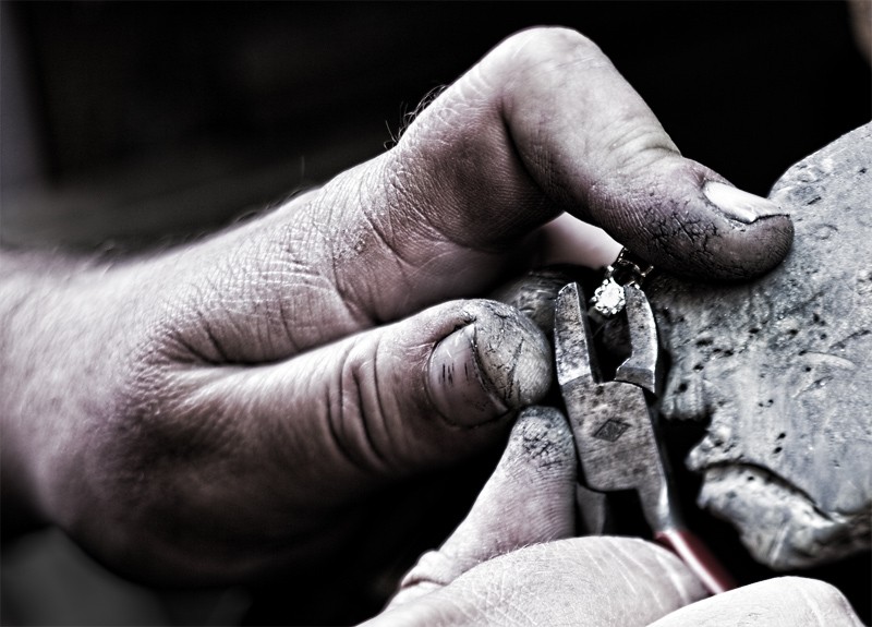
I want to show what I do. I want to show how dirty and gritty the work is, which is in contrast to what jewelery is. I want to show how small the stuff is I work on, how small the tools are, the precision, that it's done by hand.
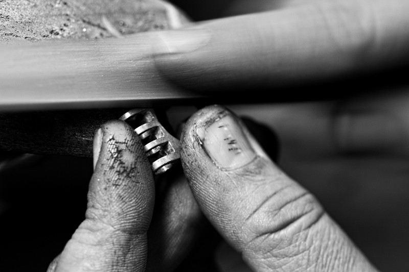
 
Contrary to Cloudwalker I find the B&W leaves me cold but the first shot is a great improvement over your first attempt. However, I would like to see more DOF because the pliers & stone are way too soft in my opinion.

Ron, still wondering how you get such soiled fingers with jewelery.
 
This is an amazing subject to tackle. Well worth the effort no matter how it drives you nuts. Not to mention how much we drive you nuts too...

The more you post, the more I realize how hard this is. Actually an SOB kind of photo if you'll excuse my french.

I love the last one you posted except that all we are seeing of you are knuckles. I and you know what the image is about and so we recognize the different elements but someone seeing this shot with no background info on it would go: ugh! Worms in my jewelry box!

And, believe it or not, this is good. It gives us an idea which way to go from here.

My newest idea is that you cannot be actually working on the ring. You need to really pose the image to get the combination. The final result will not make any sense to you or, probably, to any other person in your profession but so what?

I'm sure you are thinking I have once more gone off the deep end but making fake things to get a reality looking result is pretty common. Right now I'm thinking that is the way you have to handle this one photo..
 
Images don't always express what we want them to and it's the same with words.

Sometimes, to express what we want we have to go totally fake is what I meant with my last post.
 
Man, I love this thread.

I feel like I have no idea how to say what I want to say, I keep going back an forth thru the whole thread, and nothing helps.

This is definitely a case of needing a specialist, I think. I'm 90% sure I have seen this type of image before but it is too fuzzy to help you.

It goes to show how incredibly specialized photography can be.
 
Contrary to Cloudwalker I find the B&W leaves me cold but the first shot is a great improvement over your first attempt. However, I would like to see more DOF because the pliers & stone are way too soft in my opinion.

Ron, still wondering how you get such soiled fingers with jewelery.

I think the color of my skin is too pink though. I prefer the b&w's myself.
Yes, the pliers are OOF. Again, focusing is guesswork. That was the best of that "pose". I can't work the camera and pose at the same time. I want very shallow DoF. I equate that to portraying concentration.

Making jewelery is dirty. Gold dust from 1000 grit sandpaper embeds itself into the skin. I work with waxes, oils, polishing compounds and metals. Metal dust isn't shiny and clean.

I'll do some more, stopped way down. These have been at 4.5 and 5.6.

This is an amazing subject to tackle. Well worth the effort no matter how it drives you nuts. Not to mention how much we drive you nuts too...

The more you post, the more I realize how hard this is. Actually an SOB kind of photo if you'll excuse my french.
Is it because what you want to see, and what I want to show you are different?

I love the last one you posted except that all we are seeing of you are knuckles. I and you know what the image is about and so we recognize the different elements but someone seeing this shot with no background info on it would go: ugh! Worms in my jewelry box!
I kinda like that one, simply for the forms. Also because the texture of my skin is similar to the texture of the wood benchpin. It demostrate what we are talking about though. Either you see the hands, or you see the jewelery, but not both. But think of these printed larger. The ring would be much more visible.


And, believe it or not, this is good. It gives us an idea which way to go from here.
This is great, whether I agree with you or not. :lol:

My newest idea is that you cannot be actually working on the ring. You need to really pose the image to get the combination. The final result will not make any sense to you or, probably, to any other person in your profession but so what?
Well, they are "working" poses. I am not actually working. Other than that, I am not sure I understand what you are trying to say.


4508884309_1e95a8d160_o.jpg


4508884417_fd803828cc_o.jpg
 
Last edited:
I really like thees last two. The motion blur of the filing action is great.

In the second one, this composition works really well for me. The image is the most clear to me so far as to what is going on. The fashioning of jewelery by the worn hands of the one working his craft. Well done!
 

Most reactions

New Topics

Back
Top