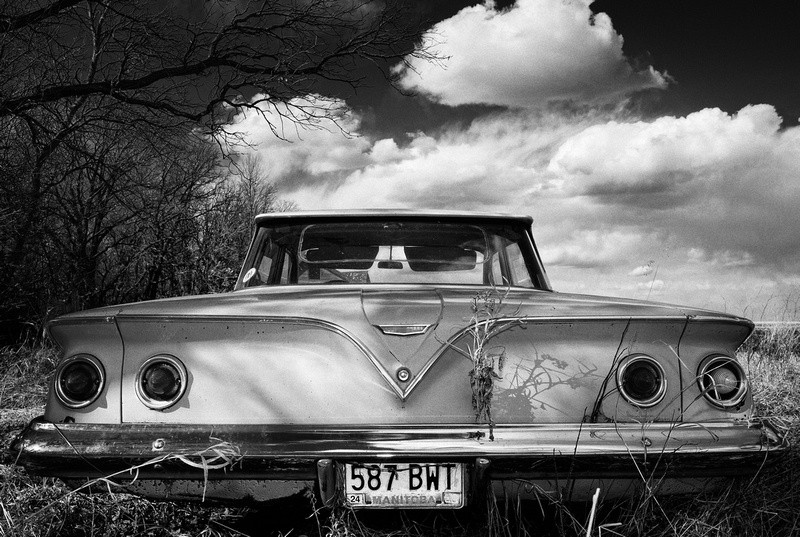
THe burn-in on the sky in the color image, and the B&W one, looks a bit too strong for this type of neo-realistic, decaying-landscape, documentary type feeling...it just draws a bit too much attention to the photographic "process" part of the photograph...it's just such an obvious vignette that it makes me more-cognizant of the fact that somebody (you, I hope!) decided, "Okay, I am going to burn those corners in pretty heavily."


") )
)


