1st maternity shoot

Hey, i checked out your link and I have to say that its really great. I like the post effects that have been used in photoshop. See how they look in B&W
 
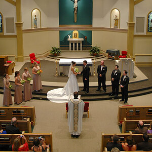
I blogged about my first maternity shoot. here's the link. My Expedition into Photography: Chelsea's Maternity Shoot

please give me your feed back. i need it.
thanks.

Kim

You've definitely got a start here...

#1 and 2 - not the most flattering angle (the angle makes her face/chin/neck look a little wider than it should). Her face needs to be brighter - expose more for her face. Remove the dark circles out from under her eyes. Next time, try a wider aperture to "blur" out the fence and background - that will make the images appear more professional.

#3 - Mostly not flattering to her legs. Have her bend her knee closest to you, putting the weight on her right leg.

#4 - Concept good, but the ambient light is definitely giving a yellow color cast.

#5 - turn your on camera flash off and use window light. This pose is also making her stomach flatten out which defeats the purpose of maternity shots.

#6 - I think this is your strongest image.

#7 - #6 was a better composition.

#8 - not flattering, camera flash needs to be turned off - this is more "snapshot-like"

#9 - concept not bad, just not real flattering. Her feet are lit, so the eye is drawn to them, and angle makes her feet look huge compared to her head.

#10 and #11 - this could work, but I think having more of the background of a baby nursery would give this image some impact. What we are drawn to with our eyes is the door... the door ends up being more the subject of the picture.

#12, 13, 14 - I personally hate the baby block thing, but I know, some people like them. These need to be lit more directional - either facing toward a window or with off camera flash. #14 has a better lighting, if you would have turned her around to face the other light that's behind her, or exposed more for the light that is in front of her.

#15 - not flattering for anyone, especially those with large thighs.

#16 -same thing - concept isn't bad, would have been better if she was styled with something flowy and on a more formal chair than a plastic one, but with this angle and outfit, all you see is her butt and thighs, not her beautiful baby bump.

#17 - #19 - This pose is more flattering when the mom is wearing jeans, long pants, a skirt, or yoga pants. With the angle, etc., your eye is drawn to her legs. Believe me, I have big legs, and I'm very sensitive to others that don't have stick legs ;)

#20 - #23 - not a fan of selective coloring myself, but I know some people like it. This would have been even better if you would have asked her not to lean as much on her left arm, place her right arm where her hand is on or below the belly, and had her legs stretched out with right leg a little over left leg (elongates the body, makes her look more elegant).

#24 - this would have had huge impact if you would have shot with a wider aperture. Your conversion could use more contrast.

#25-28 - blocks again.

BTW - hello neighbor!
 
Oh, and I really don't think her legs are bad.

They are not bad, they are "real" but maternity photography is typically looked at more like a touch of "glamour" When women are pregnant, they don't necessarily want to look "real" as in swollen, cellulite, or stretch marks. They want to view their pregnancy as glowy and beautiful.

As you get more and more clients, you will see - there is a certain expectation of the way maternity photography should look....
 
I can confirm that during my 2nd preganancy I was as far from glowy and beautiful as I could get. :lol: But I totally get what you're saying.
 

Most reactions

New Topics

Back
Top