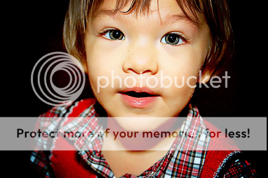
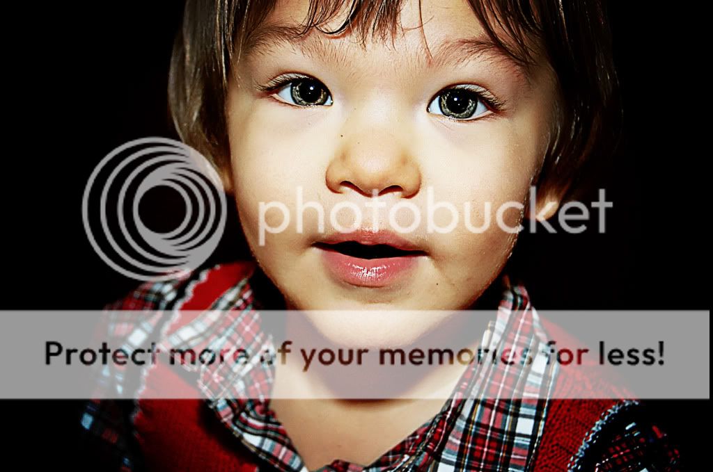
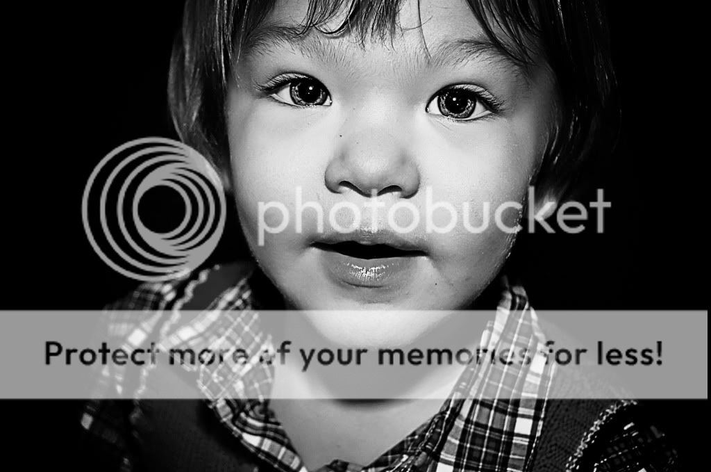
See, I like the warmer tone of the first pic. The second pic has to much of a green washed out hue to me. Have u tried this in b&w yet? It may look really good with the light in his face and the shadows surrounding him.
Is there an in between? Both are a little much. I prefer the first one though, it makes the kid seem more cute, the second one seems like something you'd do to a more serious portrait.
At first, I liked the warmer version best, but then after looking at it carefully I decided I didn't like the neck regions color, and the color lining the cheek.


![[No title]](/data/xfmg/thumbnail/34/34139-e52deba745f42ba091907fcc460cd6db.jpg?1619736311)
![[No title]](/data/xfmg/thumbnail/34/34142-948c6bafdf60862125009004d5a06e46.jpg?1619736315)
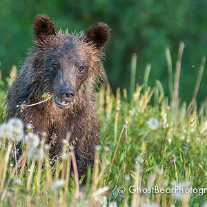
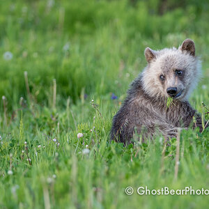
![[No title]](/data/xfmg/thumbnail/31/31749-6cf0f99d6bdedf47f7387c5b943fb717.jpg?1619734989)
![[No title]](/data/xfmg/thumbnail/38/38736-5bc266b035e23faf5ad942bdd97466a8.jpg?1619738703)
![[No title]](/data/xfmg/thumbnail/31/31748-63241c520f250328a5ec32959b8f53d0.jpg?1619734989)