What's new

A bit more exciting perhaps? C&C

greenjackson16

TPF Noob!
Joined
May 25, 2010
Messages
149
Reaction score
2
Location
Atlanta
Can others edit my Photos
Photos OK to edit
I tried to take more exciting photos, how did they turn out?

img3057.jpg

By xfish7 at 2010-12-17
^ yes, underexposed but i meant to.

img3312s.jpg

By xfish7 at 2010-12-17

img3302h.jpg

By xfish7 at 2010-12-17

img3297ig.jpg

By xfish7 at 2010-12-17
^ well i guess this one is pretty boring

img3285f.jpg

By xfish7 at 2010-12-17

img2977p.jpg

By xfish7 at 2010-12-17
 
#1 The tracks are not long enough to take advantage of the vanishing point phenomenon. It is distracting to me. Therefore I would do a camera distortion correction to make them parallel.

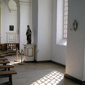
#2 I would make the ceiling lines horizontal and vertical not skewed. Sometimes skewed works but it don't work in this one for me.

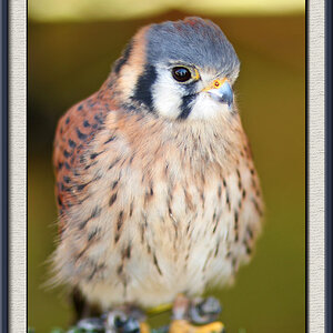
#3 make the lines vertical and horizontal. This "flaw" is best revealed on the left edge reference line

#4 Crop off the very crooked left window member for a much less distracting composition. Or straighten it out to be vertical. Clone out the word scotch.

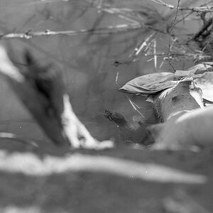
#5 Crop off the black thing on the right and the black edge at the bottom. KEEP THE REFLECTION INTACT Make the horizontal line horizontal as well as the building corner vertical. To do this straightening you will have to add more sky above the mans head. Easy to do in this shot.

#6 The vertical lines again are obviously skewed. as are the horizontal.

Even the most casual and technically disinterested viewer is emotionally impacted by vertical and horizontal lines. If they are off they get an off response or the are right and don't get an off response.

As far as the lighting goes. It is the real world and fine. The last one might need a little tweaking to extract the best result however.

Actually the "pretty boring" tape shot and the light one might be the most interesting. More than the common been there seen that shots
 
Last edited:
#1 The tracks are not long enough to take advantage of the vanishing point phenomenon. It is distracting to me. Therefore I would do a camera distortion correction to make them parallel.

#2 I would make the ceiling lines horizontal and vertical not skewed. Sometimes skewed works but it don't work in this one for me.

#3 make the lines vertical and horizontal. This "flaw" is best revealed on the left edge reference line

#4 Crop off the very crooked left window member for a much less distracting composition. Or straighten it out to be vertical. Clone out the word scotch.

#5 Crop off the black thing on the right and the black edge at the bottom. KEEP THE REFLECTION INTACT

#6 The vertical lines again are obviously skewed. as are the horizontal.

Even the most casual and technically disinterested viewer is emotionally impacted by vertical and horizontal lines. If they are off they get an off response or the are right and don't get an off response.

As far as the lighting goes. It is the real world and fine. The last one might need a little tweaking to extract the best result however.

thank you, I haven't given much thought to lines in the past, but i think that I should start to look into improving it.
 

Create an account or login to comment

You must be a member in order to leave a comment

Create account

Create an account on our community. It's easy!

Log in

Already have an account? Log in here.

Back
Top Bottom