A Bridge and a Tree

PixelRabbit

A naughty little bunny...
Joined
Nov 28, 2011
Messages
6,593
Reaction score
3,719
Location
Ontario
Can others edit my Photos
Photos NOT OK to edit
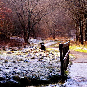
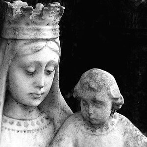
I'm working on retiring one of my drives and going through everything one last time, found these two today :) 
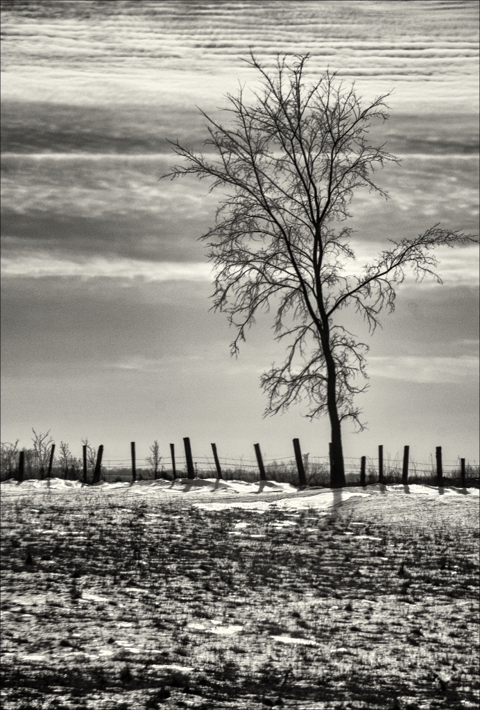
I thought I would post the two together so I don't have ANOTHER tree thread ;)

Would love to hear your thoughts, thanks for taking a look!


#1 Great perspective. This bridge asked for camera.
#2 Nice, romantic. Is this from that lost folder ?
 
Thanks T, yes!! the tree is from that folder! I am quite surprised you put that together ;) Way cool!
 
I think I'd remove the clearance sign from the bridge; your perspective makes it appear as though the sign is on the road on the far side of the bridge, but I like the shot!
 
Thanks T, yes!! the tree is from that folder! I am quite surprised you put that together ;) Way cool!
Eh... Snow.
Tirediron is right about that sign.
 
You know... that bridge needs a four-season quadriptiche. Or a mood triptych (Bright/misty/mooney...) You know where I'm going with this.
 
^ wow. Seriously. :lol:


Pix... love the tree one. :)
 
I think the bridge is too confusing. There's the sign, but then there's also the two layers, the bridge and the stuff beyond, and I'm not fully getting the point. It feels like too much stuff, not particularly awesomely arranged. I don't hate it, but it doesn't feel strong to me.

The three is awesome, though. Love the variety of strong horizontal textures, all pulled together and unified by the tree.
 
Great photos! Especially the bridge minus the sign.
 
I really like #1! As far as the sign, take it or leave it. It doesn't bother me, but I could see how some people might not like it. My ONLY critique, and its a tiny one, is the dark cloud in the upper right corner. I like how my eye goes down the road, but then right at the end, when I wish my eye would swim off to the distance, *shunk*, it zips right to that cloud...

On #2, AWSOME! Again, only one tiny critique, and this is probably personal preference, but I used my super calibrated fingers, and looked at a crop romoving the dark horizontal line at the bottom, and preferred it with that slightly tighter crop.

Nice shots overall!
 
Thanks for your thoughts all!
The sign didn't even cross my radar, I don't mind it and find it interesting how it is reading for others!

Crimbfighter, good point about those darker lines in both of them, I shall tinker before they get archived ;)
 
I like the sign on the bridge. It adds interest to the shot. If the perspective is confusing to people maybe you could just clone out the stripped section. Either way it didn't bother me as much as it did others.

#2 is money. Love how the clouds created a repeating pattern with the horizon.
 

Most reactions

Back
Top