PixelRabbit
A naughty little bunny...
- Joined
- Nov 28, 2011
- Messages
- 6,593
- Reaction score
- 3,719
- Location
- Ontario
- Can others edit my Photos
- Photos NOT OK to edit
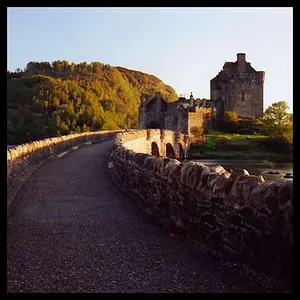
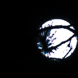
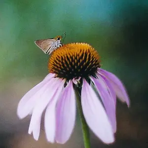
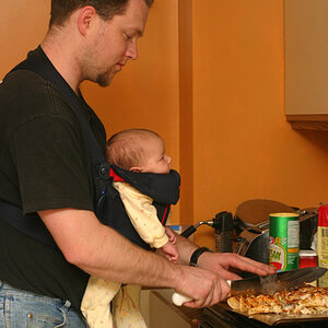
I'm working on retiring one of my drives and going through everything one last time, found these two today  I thought I would post the two together so I don't have ANOTHER tree thread
Would love to hear your thoughts, thanks for taking a look!
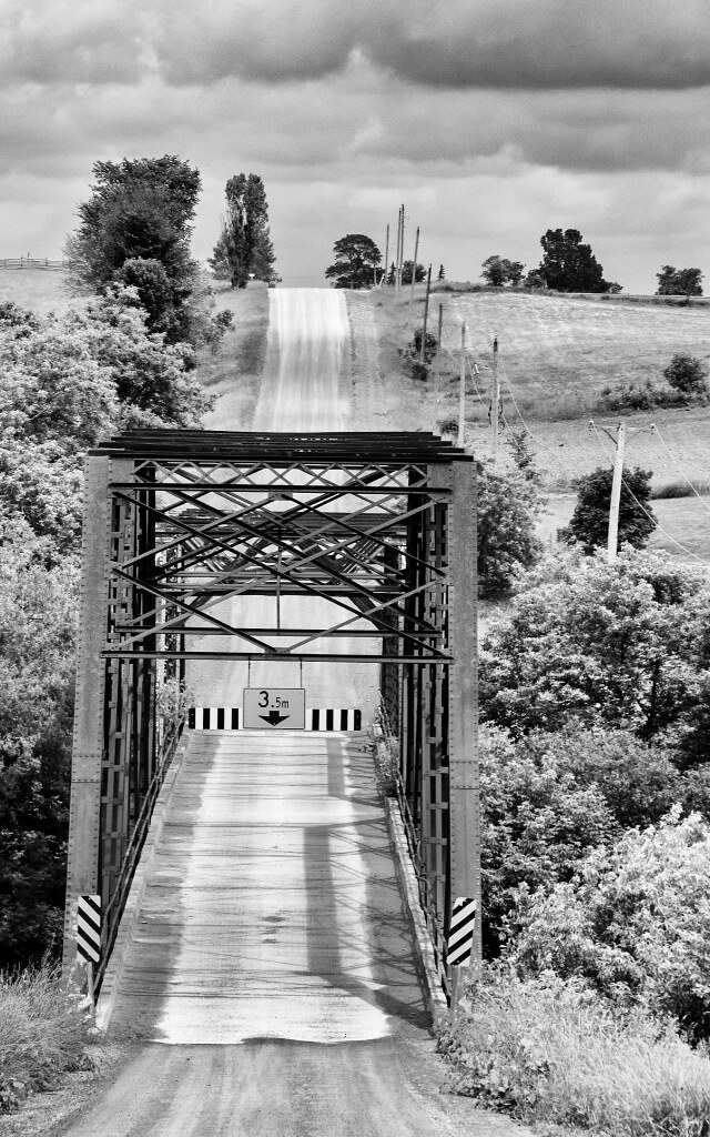
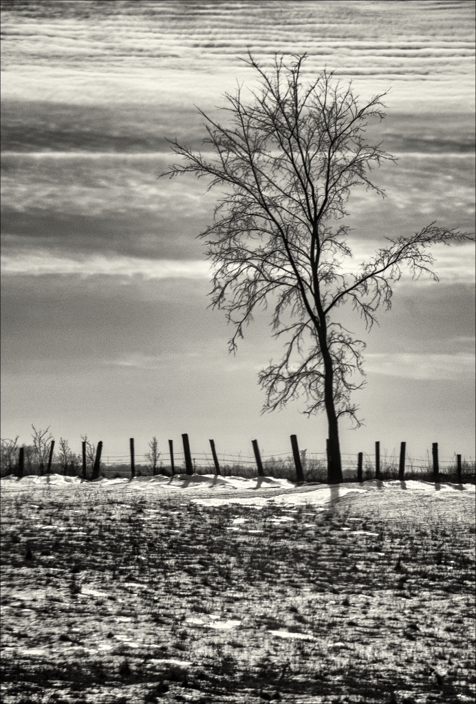
I thought I would post the two together so I don't have ANOTHER tree thread Would love to hear your thoughts, thanks for taking a look!