What's new

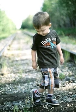
A close up for critique

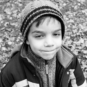
High-key, just not my liking. I think it's a little too bright for me, especially the right side of his face, our left. I find the two leaves to be very distracting that lay right on his chest.
 
412 Burgh said:
High-key, just not my liking. I think it's a little too bright for me, especially the right side of his face, our left. I find the two leaves to be very distracting that lay right on his chest.

I agree about the leavesبعلاوة
 
I agree that the side of the face is just too light. Seems like it could be easily fixed however. yes, the leaves are somewhat distracting but the lighting of the face is more distracting for me,
 
Well i like it despite of the lighting. I cant control where lighting is coming from if im taking a picture from a top looking down, it was in the shade as well.
 
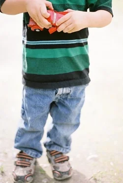
Ok here is another pic if you would like to critique on this one. Same setup as before.
 

Attachments

  • $image-3035390183.webp
    $image-3035390183.webp
    97.2 KB · Views: 214
Well i like it despite of the lighting. I cant control where lighting is coming from if im taking a picture from a top looking down, it was in the shade as well.


well, that's really all that matters in the long run isn't it ? I never said I didn't like the photo. You wrote "please comment" so we did. If you think it's perfect the way it is then don't bother asking for comments because you might find others who think it could be improved. Anyhow, for the record I do like the 2nd shot a lot better.
 
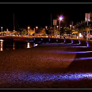
Well i do enjoy your critisizm. I agree that it not perfect. The leaves in the foreground i did not notice as being distracting so thanks for pointing that out. Here is the third one from this roll of film. Same setup as the rest.
 

Attachments

  • $image-498791869.webp
    $image-498791869.webp
    41.4 KB · Views: 196
Where's the REST of the third one? He seems to be missing his head. ;)

First one, I agree the leaves are a distraction. The lighting doesn't bother me, but the pose does. I suppose it's because, with his arm reaching out of the frame like that, it reminds me of all the teenage self-portraits, holding their phone camera out at arms length and above them and snapping away. I KNOW that's not what this is, but the similarity is striking.

The second one, I personally think the sky is just a little too blown out, and again, I'm not a big fan of the pose, but the exposure is nice. The pose, to me, just says, "Ewww, what's that on my shoe?" And we can't see his cute little face.
 
Well i like it despite of the lighting. I cant control where lighting is coming from if im taking a picture from a top looking down, it was in the shade as well.

You can control the camera though. The more you know about your tools, the less you are a slave to circumstances.
 
The_Traveler said:
You can control the exposure.

That doesn't have anything to do with half of his face being lighter than the other half. Its because he was looking up and there is no way to back light someones face when they are looking up at the sky and the sun is comming from the south...

Its over exposed on purpose because that is how i like it. I dont use fill flash because i want my subjects back lit and over exposed with natural light. This picture just happened to be one of those case where the light had to be comming from the side. However i still made sure it was shaded so as not to have a major difference in lighting.
 
3bayjunkie said:
That doesn't have anything to do with half of his face being lighter than the other half. Its because he was looking up and there is no way to back light someones face when they are looking up at the sky and the sun is comming from the south...

Its over exposed on purpose because that is how i like it. I dont use fill flash because i want my subjects back lit and over exposed with natural light. This picture just happened to be one of those case where the light had to be comming from the side. However i still made sure it was shaded so as not to have a major difference in lighting.

Since when did the sun come from the south? The last 4.5 billion years or so, it came up in the east and went down in the west.

Also why do you ask for comments if you just reject them and defend your poor choice in camera work? I'd hate to see how you react to C&C on the wedding photos you've taken.

Photo 3 is essentially entirely out of focus. Photo 2 lacks sharpness in the face. Photo 1 has had plenty of comments so far that I am on the same page with.
 
Yeah, the 2nd is so OOF it completely ruins it for me. I do like the first one but I think the right side of his face could be burned a little bit so it doesn't seem almost o the verge of overexposure
 
o hey tyler said:
Since when did the sun come from the south? The last 4.5 billion years or so, it came up in the east and went down in the west.

Also why do you ask for comments if you just reject them and defend your poor choice in camera work? I'd hate to see how you react to C&C on the wedding photos you've taken.

Photo 3 is essentially entirely out of focus. Photo 2 lacks sharpness in the face. Photo 1 has had plenty of comments so far that I am on the same page with.

If you lives in alaska the sun rises in the NE and sets in the NW and spends most of the day in the southern sky.

I do not disregard your comments, but my photos look they way they so on purpose. Im mostly looking for what you like about the photo and what you think about the compoaition. Im pretty much set in my exposure formula. I dont see where any of my photos are out of focus though.
 

Create an account or login to comment

You must be a member in order to leave a comment

Create account

Create an account on our community. It's easy!

Log in

Already have an account? Log in here.

New Topics

Back
Top Bottom