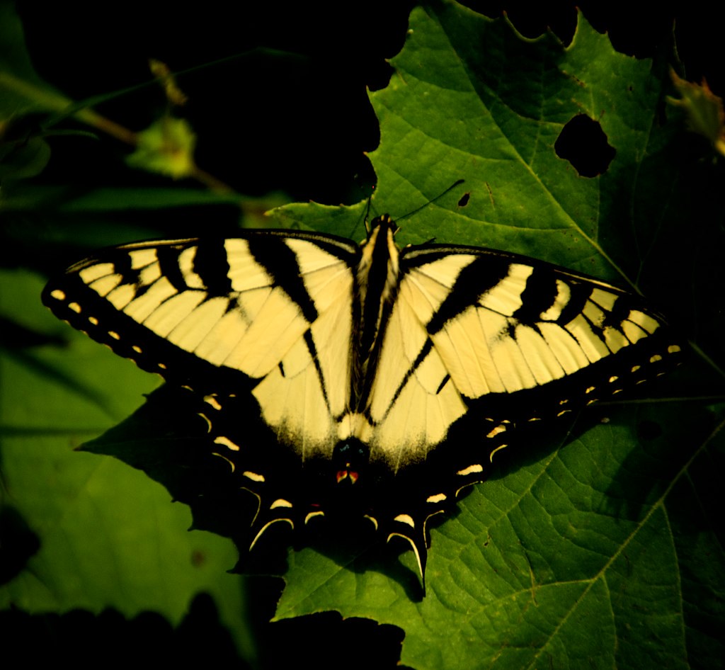
A Couple Nature Pieces

Glycerol Sound

TPF Noob!
Joined
May 22, 2010
Messages
177
Reaction score
6
Can others edit my Photos
Photos OK to edit
Just been out shooting, these are the ones I kept out of a lot. Guess it always works out that way haha.

4781212453_6046e005cf_b.jpg


4781203351_9d30cf6bb8_b.jpg


4762901928_0f253aeb77_b.jpg


4781579839_263ccdbdea_b.jpg
 
1-The blue looks really unnatural; try fixing the white balance
2- No doubt the best of the bunch; it's perfect!
3- Seems a little underexposed and the white balance is off.
4- OOF
 
1) okk
2) would look better if there wasn't other plants in the background
3 and 4 are out of focus and soft.
 
2) would look better if there wasn't other plants in the background


I agree, #2 would be better without the other plants in the bottom of the photo, maybe next time a different angle - from a lower positon.
 
I feel like I should add that 1 has post on it to emulate a cyanotype (I've seen this effect around and I wanted to see if I could make something work in it), and 3 was edited with a ton of contrast to the point where it has all that blackness. I appreciate the feedback though!
 
I like 2 the best. #1 is decent by the cyanotype effect could maybe be toned down a little? Nice different take on the typical flower shot though.

The last two seem OOF or soft to me. Also, the last one has a bit of a color cast/color contrast issues I think.

I am on my laptop, so some of this may not be 100% accurate. This screen sucks.
 
Thank you, glad you liked them :)
 
I'll agree with 3 & 4 seemingly out of focus. I like the treatment of #1. It is different that your typical flower shot. I would like to see it cropped so that the flower is not in the center of the frame. Nice job.
 
Backgrounds are so, so important.

I was going to say exactly what pbelarge said.

#2 is the best of the bunch still has the background issues. They can't be cropped away, or the composition suffers to much. A camera location 3 inches lower, and clone out the lone piece lower left.....

#'s 1 and 4 have insufficient DOF for the subjects and the perspectives.

I like the coloration of #1, but not the DOF and centering.
 
Thank you for that in depth critique there. I guess I really need to open my eyes more and pay attention to whats around my subject and not just the subject itself. I'll keep it in mind and thanks again
 
I'm not the best at this kind of editing, but I thought I take a stab at it :)

47812033519d30cf6bb8b.jpg
 

Most reactions

New Topics

Back
Top