What's new

A couple of abstract waterscapes

invisible

Been spending a lot of time on here!
Joined
Mar 10, 2007
Messages
5,213
Reaction score
983
Location
Canada
Can others edit my Photos
Photos NOT OK to edit
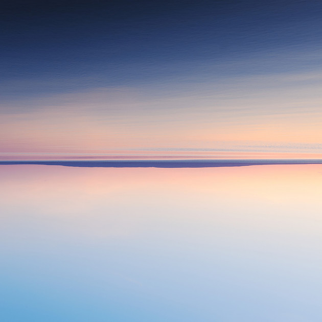
Not everybody's cup of tea, but here we go anyway...

1.
p332214555-4.jpg


2.
p914127024-4.jpg


Thanks for looking...
 
Technically speaking I am too new to photography to comment, but artistically I am fascinated by #1. It draws me in. The second one has a very peaceful feel.:)
 
Wow, I don't usually stare long at photographs but #1 drew me on. Not sure why, maybe cause I'm new and wonder how the hell you did that lol
 
I don't like the 50-50 bisection of the frame in #1...the 1/3-2/3 balance in #2 appeals more to me...it feels more tranquil to me, with more water and less sky, and more "weight" at the bottom. I don;t want to sound like a contrarian, but I actually feel some repulsion when looking at #1...I just can hardly stand to look at it...but #2 on the other hand, draws me in, and I WANT to look at it!

 
I like #1 better but would crop about 25% off the bottom.
 
Good fun!! I like this side of you...=)
 
This is my cup of tea for sure, but only after pouring out some to the level of 2/3rd ;)
 
but I actually feel some repulsion when looking at #1...I just can hardly stand to look at it...
Best comment I've ever received :)

Turn the top one 90° CCW for a good time. :sexywink:
LOL!

Thanks everybody for taking a look and commenting, especially those of you who were left at the verge of throwing up :lmao:
 
#1 is very unsettling if you look at it for more than like a few seconds - I love it!
 
#1 is very unsettling if you look at it for more than like a few seconds - I love it!
Thank you! Unsettling was not in my mind when I created this, though.
 
Actually, I should have used the word "hypnotizing" instead, that fits better than unsettling. It reminds me of staring at a campfire.
 
Actually, I should have used the word "hypnotizing" instead, that fits better than unsettling. It reminds me of staring at a campfire.
Aaah, the beauty of abstract imagery :)
 
Derrel said:
I don't like the 50-50 bisection of the frame in #1...the 1/3-2/3 balance in #2 appeals more to me...it feels more tranquil to me, with more water and less sky, and more "weight" at the bottom. I don;t want to sound like a contrarian, but I actually feel some repulsion when looking at #1...I just can hardly stand to look at it...but #2 on the other hand, draws me in, and I WANT to look at it!

I have to disagree with you for number one. I find the 50/50 split really works for this image as it gives you a the impression of split between two workds/dimensions. Which I find interesting.

The second photo is also a win, love the calmness and provides a much different feel than the first.

These photos really remind of a nice soft painting. They would fit nicely in a huge white foyer.

Nice work Invisible!
 

Create an account or login to comment

You must be a member in order to leave a comment

Create account

Create an account on our community. It's easy!

Log in

Already have an account? Log in here.

New Topics

Back
Top Bottom